Images: Death to Stock · Fancy Scene Generator · Pexels · Pixeden
If you have any questions feel free to send a message via this contact form.
To install this Theme you must have working version of WordPress 3.8 or higher.
If you need help installing WordPress follow the instructions in official WordPress Codex.
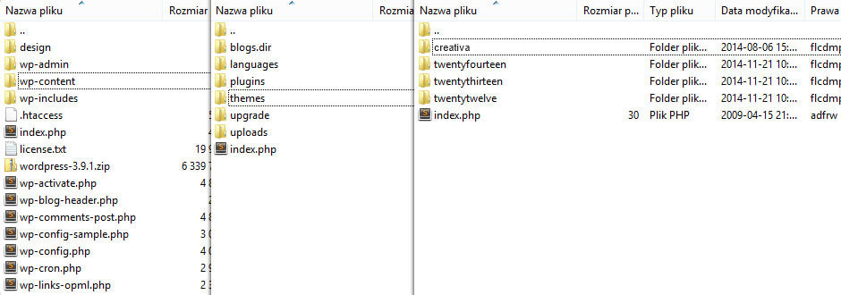
List of Items contained in "Main File(s)" package purchased and downloaded via themeforest.net:
You can install Creativa Theme in two ways. Directly with WordPress (easier and faster way) or via FTP.
In WordPress Admin Panel go to Apperance -> Themes. Click Add New Button, then click Upload Theme.
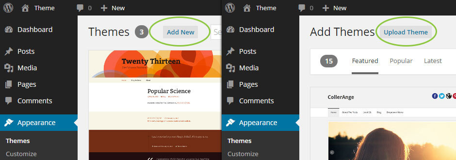
Select creativa.zip file and click Install Now Button
Wait until installation process will be done.
Sometimes you might have "max upload filesize" problem. To solve this problem follow instructions in this article.
Unzip creativa.zip file into creativa folder. Make sure that in creativa folder you don't have any other subfolder – only theme files and subfolders.
Log in to your hosting service via FTP Client (e.g. FileZilla)
Find there WordPress installation and then go to wp-content -> themes
Upload creativa folder into themes. Wait until you have uploaded all theme files.
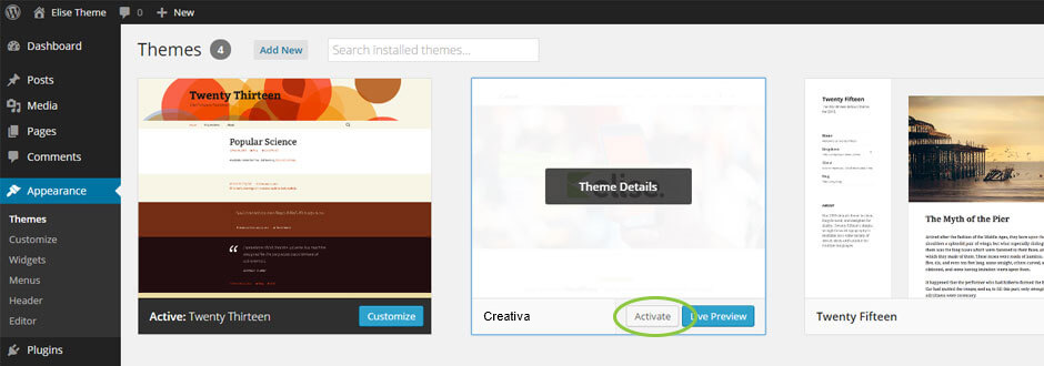
Activate Theme right after installation or go to Appearance -> Themes and click Activate Button
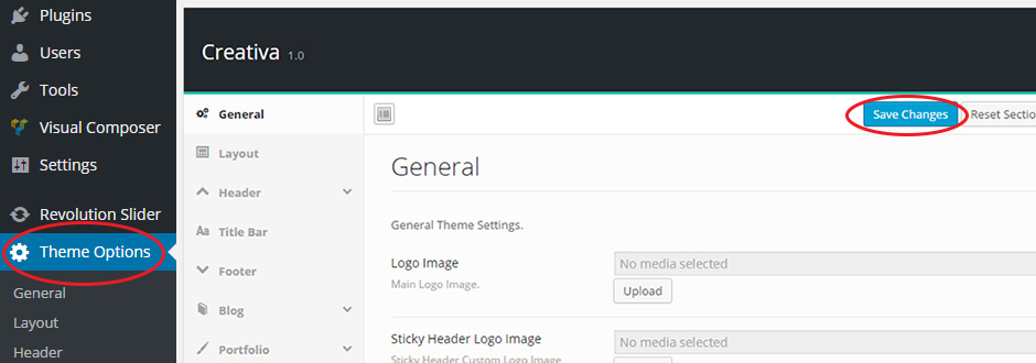
This step is very important!.
Go to Theme Options panel and click Save Changes button. This step will save all theme option variables into database.
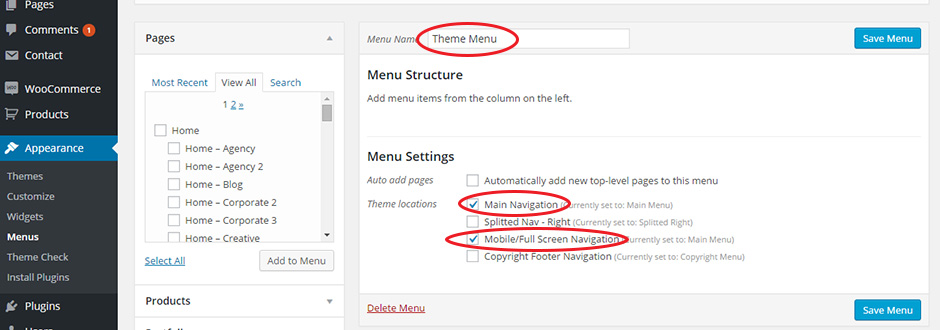
Last step is to create main menu area. Go to Appearance -> Menus then create main menu with your menu name (e.g. Main Menu) and click Save Menu.
After that assign your Main Menu to "Main Navigation" location. It's also recommended to assign Main Menu to Full Screen/Mobile Navigation.
Congratulations! Creativa Theme is ready to use. Enjoy! :)
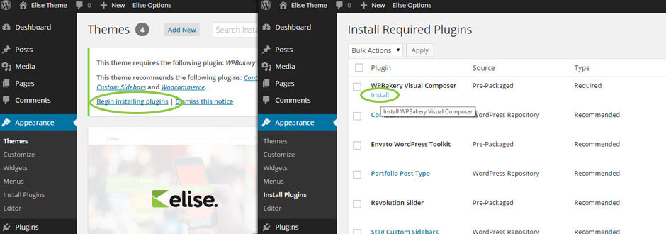
Creativa includes a few recommended plugins, fully styled and 100% compatible with theme. See list of all plugins below.
Plugin installation is very simple. After intallation you will notice info box with required and recommended plugins.
All you need to do is click Begin installing plugins, then select particular plugins you need and click Install.
After short while your chosen plugins will be ready to use.
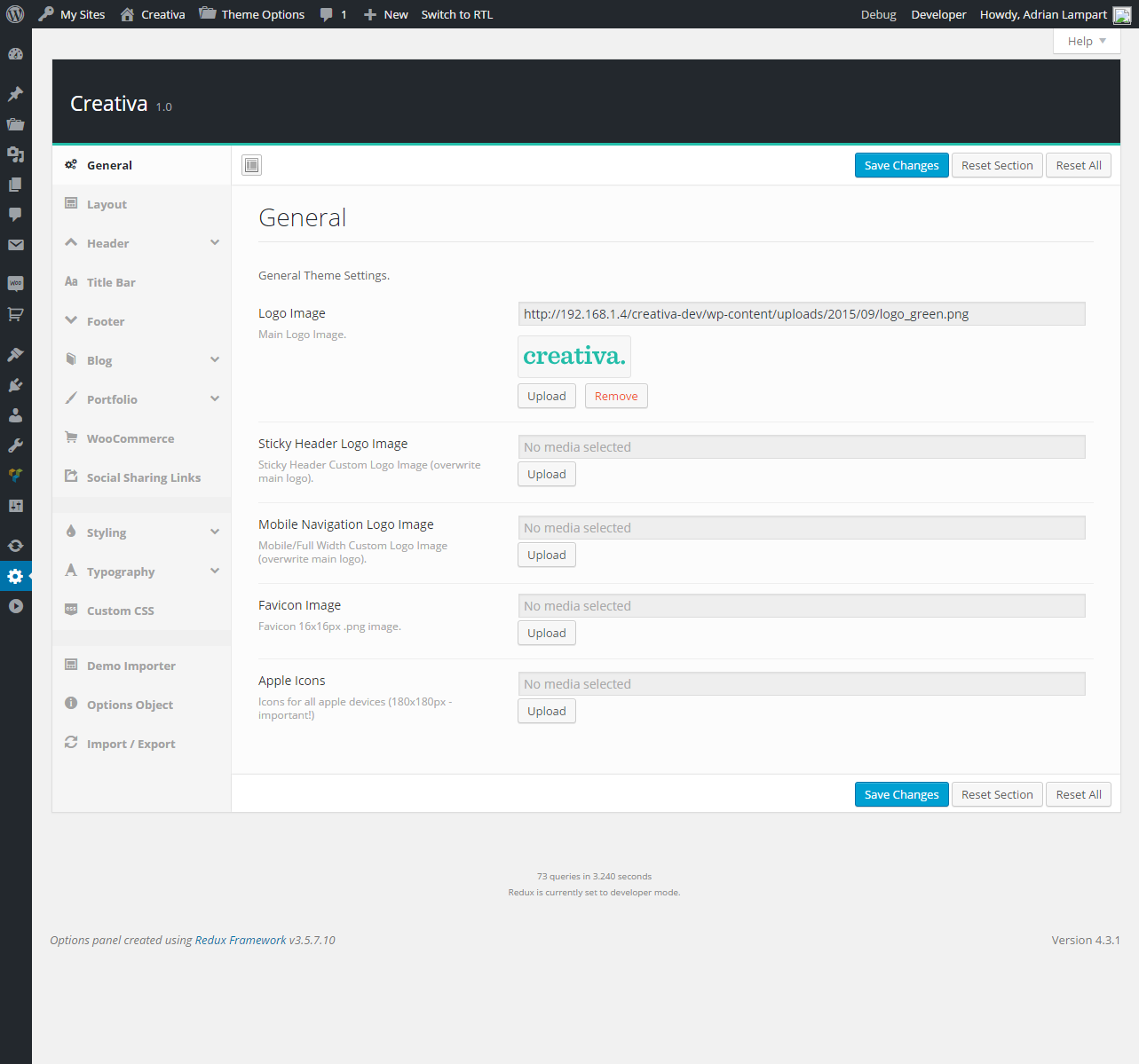
Global Options allows you to change theme apearance globaly with few simple clicks. All theme options shows screenshots below.
It's also possible to overwrite global options and set custom settings for only patricular pages you need.
There is Page Title options and styling, Header options and styling and more.
Layout Tab allows to change page layout on few ways. They are described in detail below.
This option allows to pick one standard of side navigation layout:
StandardLive Example
SideLive Example
This fields allows to set side navigation position.
Body Layout.
This option allows to pick one of three page layouts:
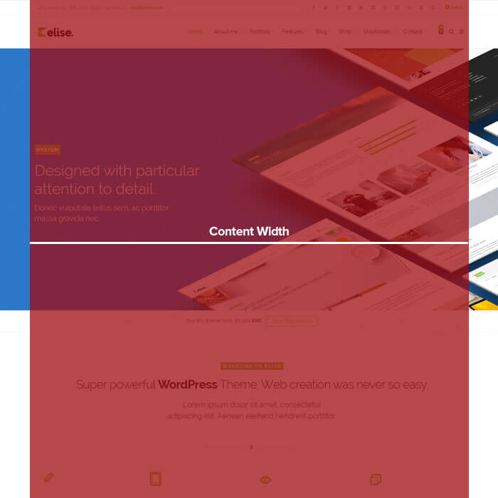
This option allows to select container width from 960 to 1200 pixels.
This option allows to set gap between conent and background.

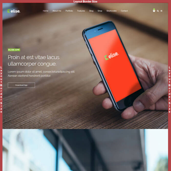
This option allows to set layout border size.
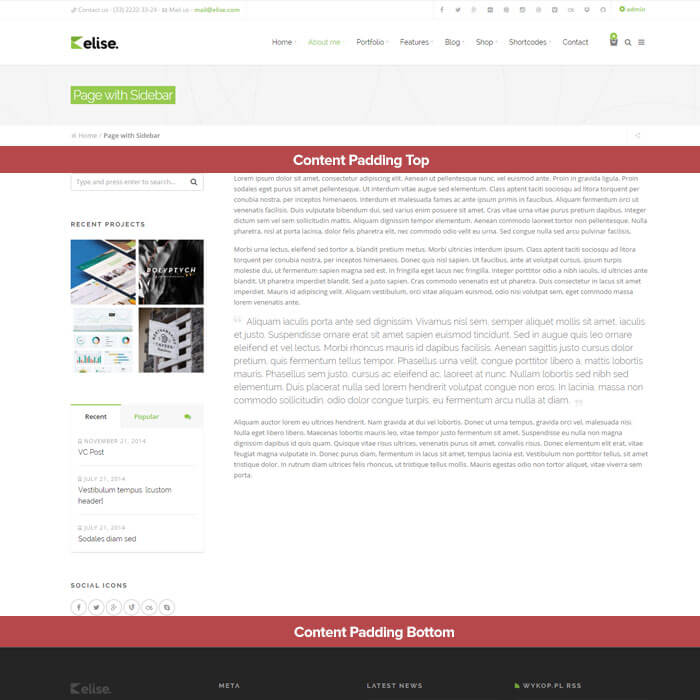
This option allows to select content padding top and bottom.
This fields allows to set page background.
Usability.
This option allows to enable or disable page sharing button on each page.
This option allows to enable or disable Back to Top button.
Header Tab allows to set header layout on over 30 ways.
This option allows to pick one of five header layouts:
This option allows to stretch navigation to full width.
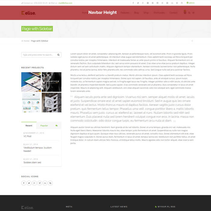
This option allows to set navbar height from 60 to 300 pixels.
This option allows to pick left, center or right position of Main Menu.
This option allows to pick one of two menu hover styles.
Full Height HoverLive Example
Boxed HoverLive Example
This option allows to enable or disable separator lines on navigation bar.
This option allows to enable or disable searching page in navbar.
This option allows to enable or disable 'hamburger' icon for secondary navigation.
This option allows to enable or disable shopping bag icon for WooCommerce plugin.
This option allows select icons style.
Sticky Header Tab
This option allows to enable or disable sticky header.
This option allows to set sticky header height.
This option allows to pick one of two sticky header styles.
On ScrollLive Example
On Scroll TopLive Example
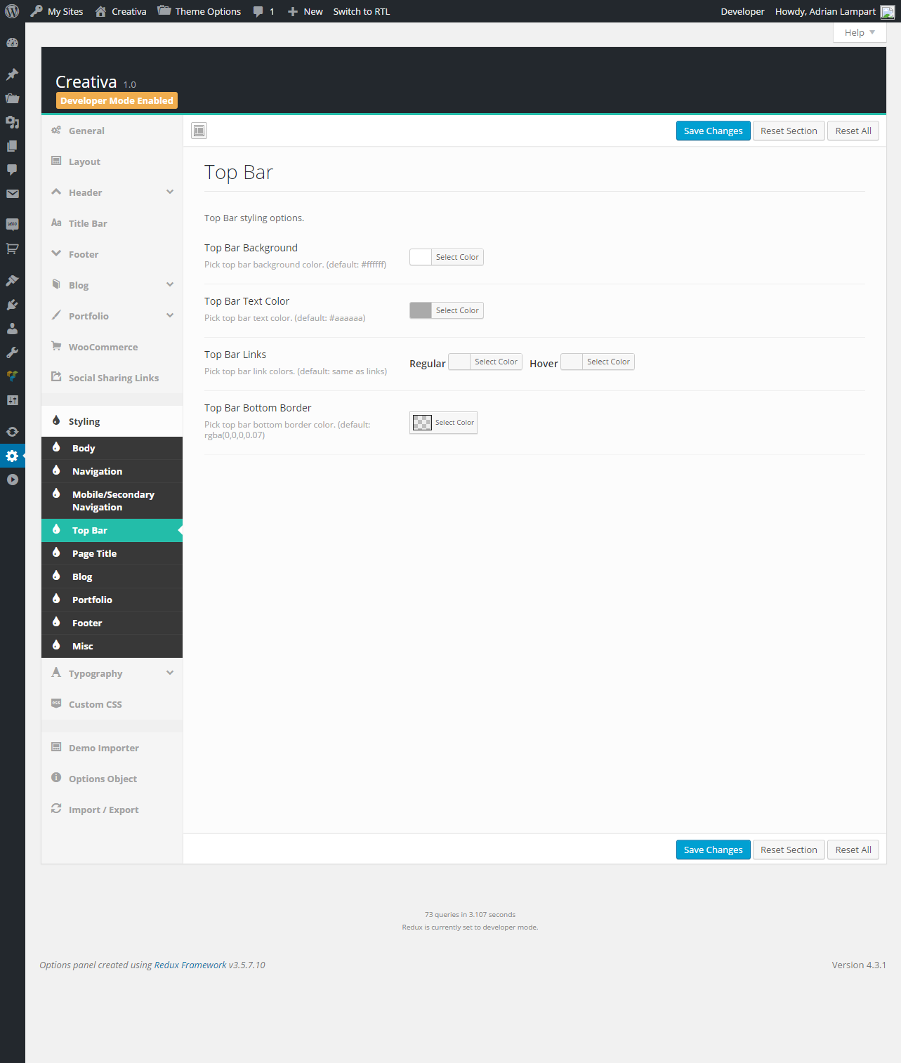
Top Bar Tab
This option allows to enable or disable top bar above header.
Top Bar Content field.
This option allows to pick one of two sticky header styles.
Sidebar NavLive Example
Full Width NavLive Example
Title Bar Tab.
This option allows to enable or disable title bar.
This option allows to select position of page title.
SideLive Example
CenterLive Example
This option allows to set title bar top and bottom margin.
This option allows to enable or disable breadcrumbs.
Page Title Animations.
This option allows to select page title background effect while scrolling.
This option allows to select page title content effect while scrolling.
This option allows to select page title canvas animation effect.
Single Post/Project Cover.
This option allows to enable/disable image covers on single blog and portfolio page.
This option allows to set cover image height.
This option allows to set cover image size.
This option allows to set overlay color over cover image.
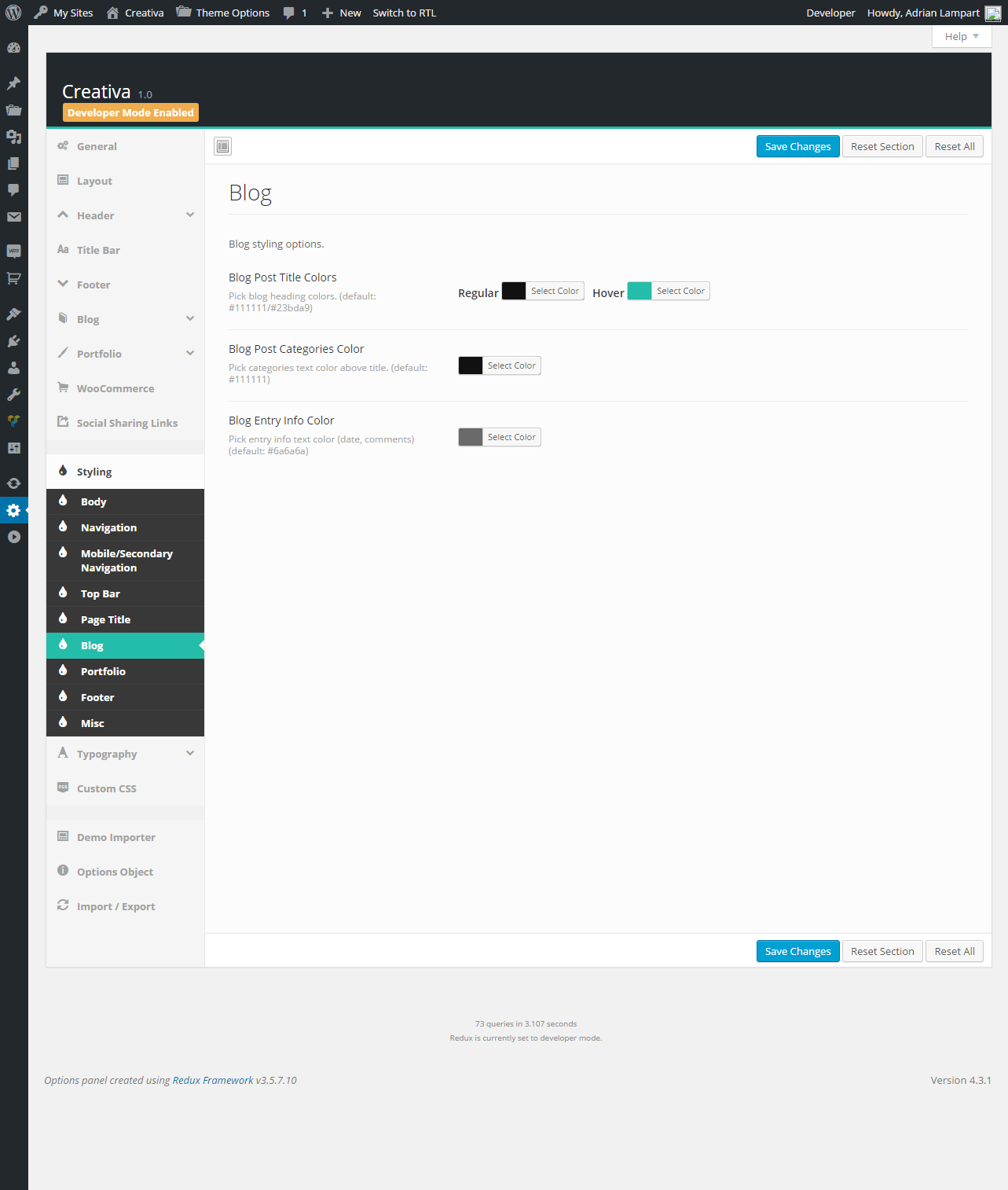
Blog Tab.
This option allows to select one of four blog styles.
ListLive Example
MasonryLive Example
This option allows to enable/disable full widht size blog layout.
DefaultLive Example
Full WidthLive Example
This option allows to enable or disable blog sidebar.
This option allows to select sidebar position.
RightLive Example
LeftLive Example
Post Display Settings.
This option allows to enable or disable post thumbnails on blog page.
This option allows to enable or disable posts custom styles.
This option allows to set default post display style.
This option allows to enable or disable automatic posts excerpts.
This option allows to set excerpt lenght.
This option allows to enable/disable display of post categories above post title.
This option allows to enable/disable display of post date above post title.
This option allows to enable/disable display of post comment count above post title.
This option allows to enable/disable display name of post author.
Single Blog Page Tab.
This option allows to set custom Single Posts Layout, different than blog layout. Globally or for Single Post.
Left SidebarLive Example
Right SidebarLive Example
This option allows to enable or disable display of thumbnail/media on post page.
This option allows to enable or disable displaying post author's bio.
This option allows to enable or disable post share buttons.
This option allows to enable or disable display of posts tags.
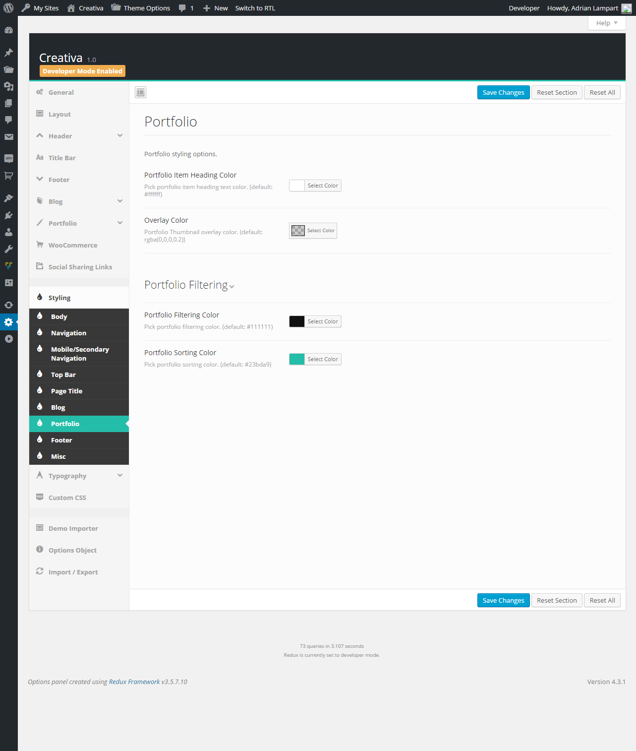
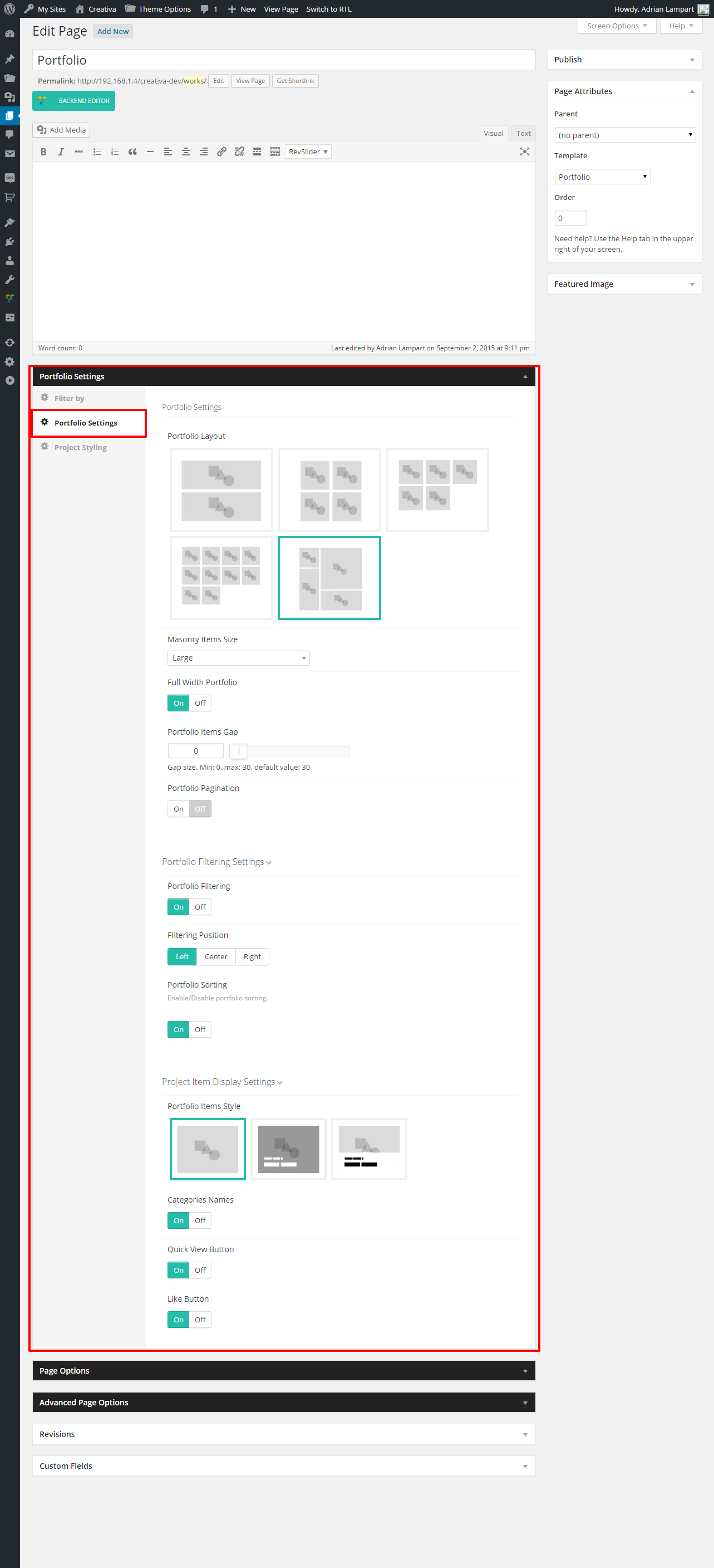
Portfolio Tab.
This option allows to select one of five portfolio styles.
1 ColumnsLive Example
2 ColumnsLive Example
3 ColumnsLive Example
4 ColumnsLive Example
MasonryLive Example
This option allows to select size of masonry layout.
MediumLive Example
LargeLive Example
This option allows to set full window width portfolio.
This option allows to set gap between portfolio items from 0 to 30 pixels.
This option allows to paginate portfolio items.
This option allows to set custom project slug.
Portfolio Filtering Settings.
This option allows to enable or disable portfolio items filtering.
This option allows to set filtering position.
This option allows to enable or disable portfolio items sorting.
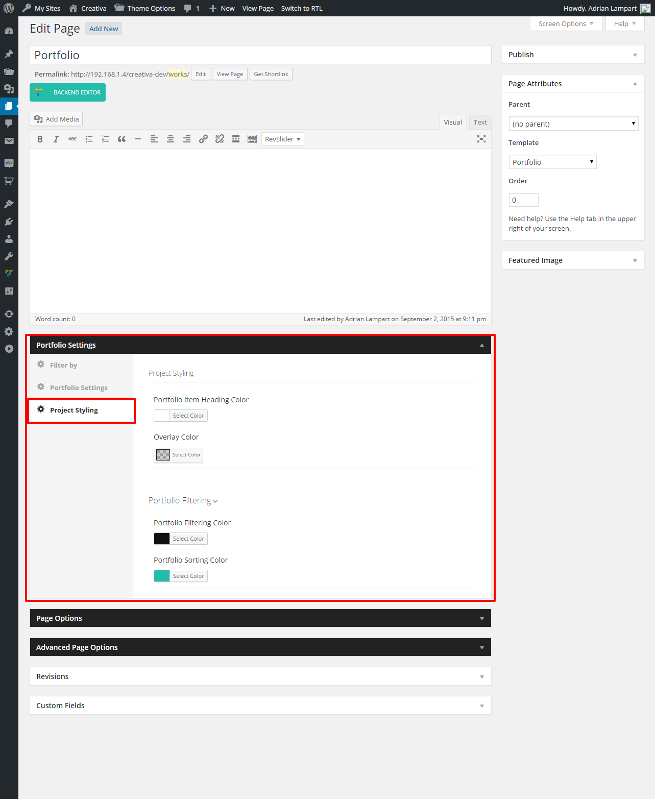
Portfolio Tab.
This option allows to set one of two portfolio items styles.
This option allows to enable or disable categories name above the Project title.
This option allows to enable or disable quick view button.
This option allows to enable or disable like button.
Project Page Tab.
This option allows to set single project layout. It's also possible to set custom project layout for single project page.
This option allows to set single project layout. It's also possible to set custom project layout for single project page.
RightLive Example
LeftLive Example
This option allows to set one of two way of displaying gallery images.
SliderLive Example
ListLive Example
This option allows to enable or disable share buttons on project page.
This option allows to enable or disable previous and next project buttons.
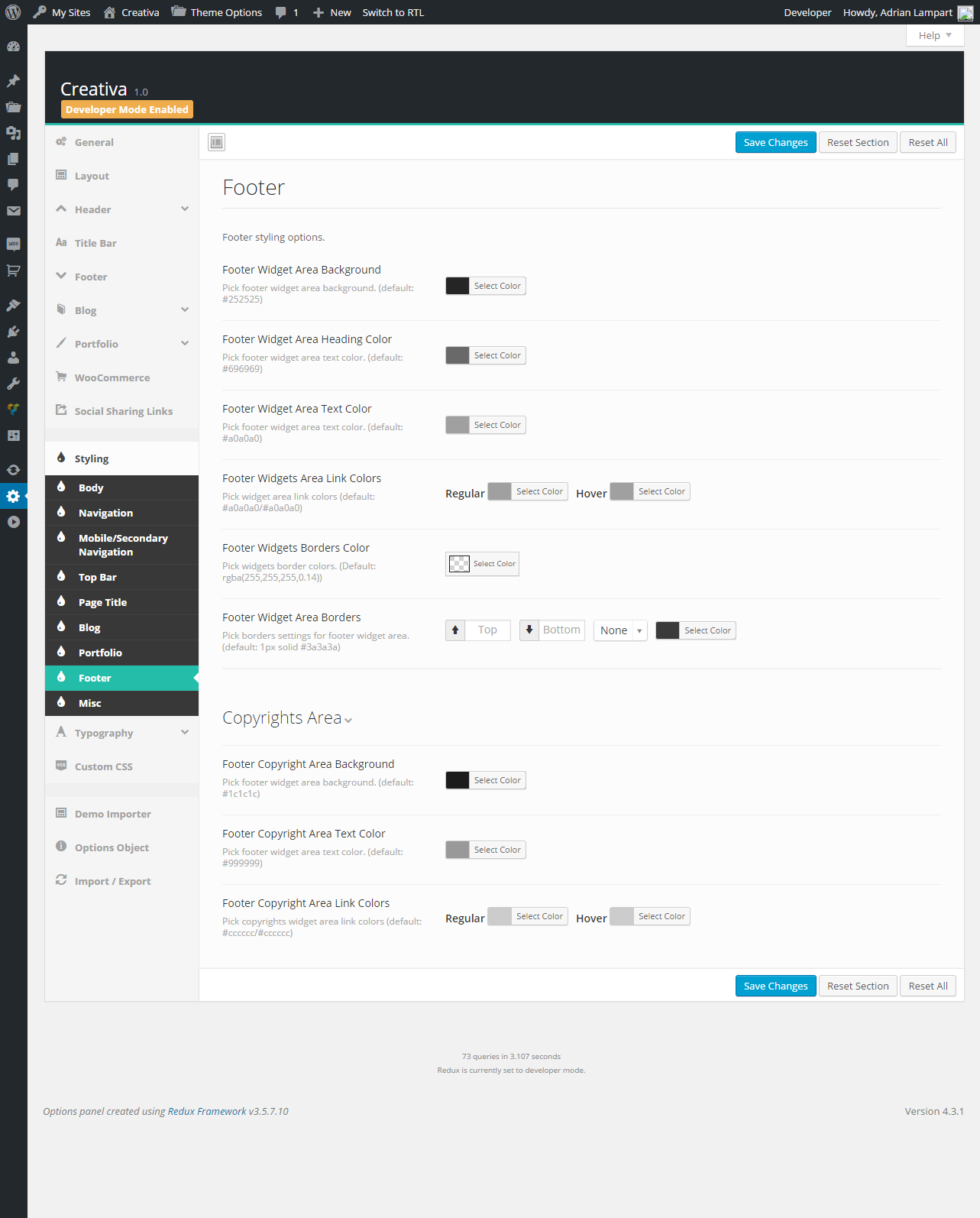
Footer Tab.
This option allows to set footer effects.
DefaultLive Example
FixedLive Example
This option allows to enable or disable footer widget area.
This option allows to select columns set of footer widget areas.
Copyright section text field.
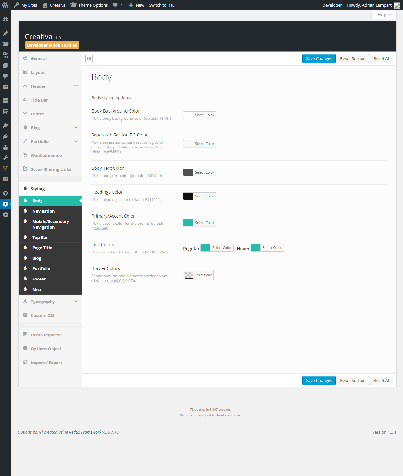
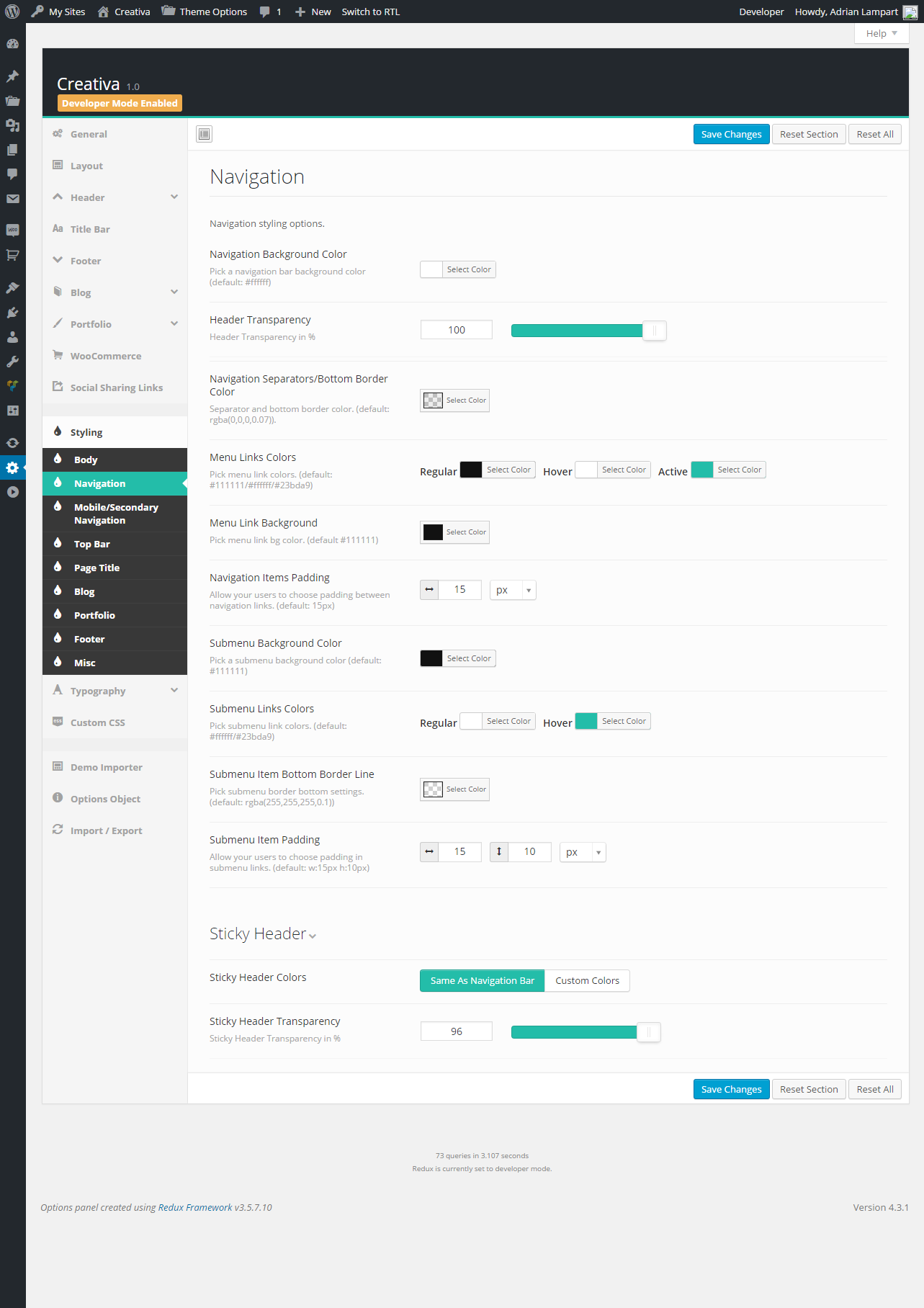
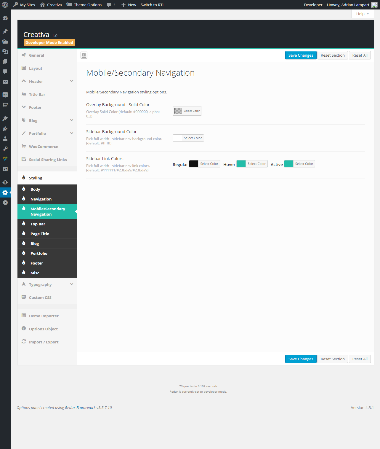
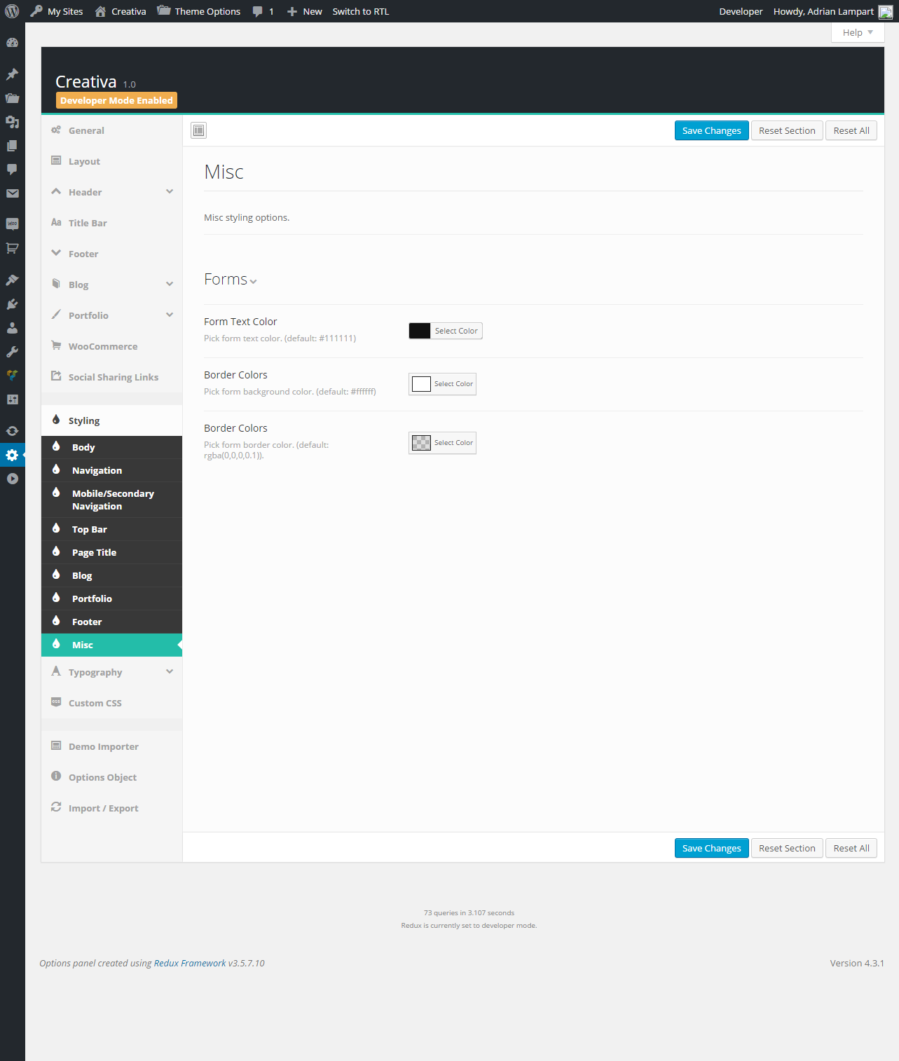
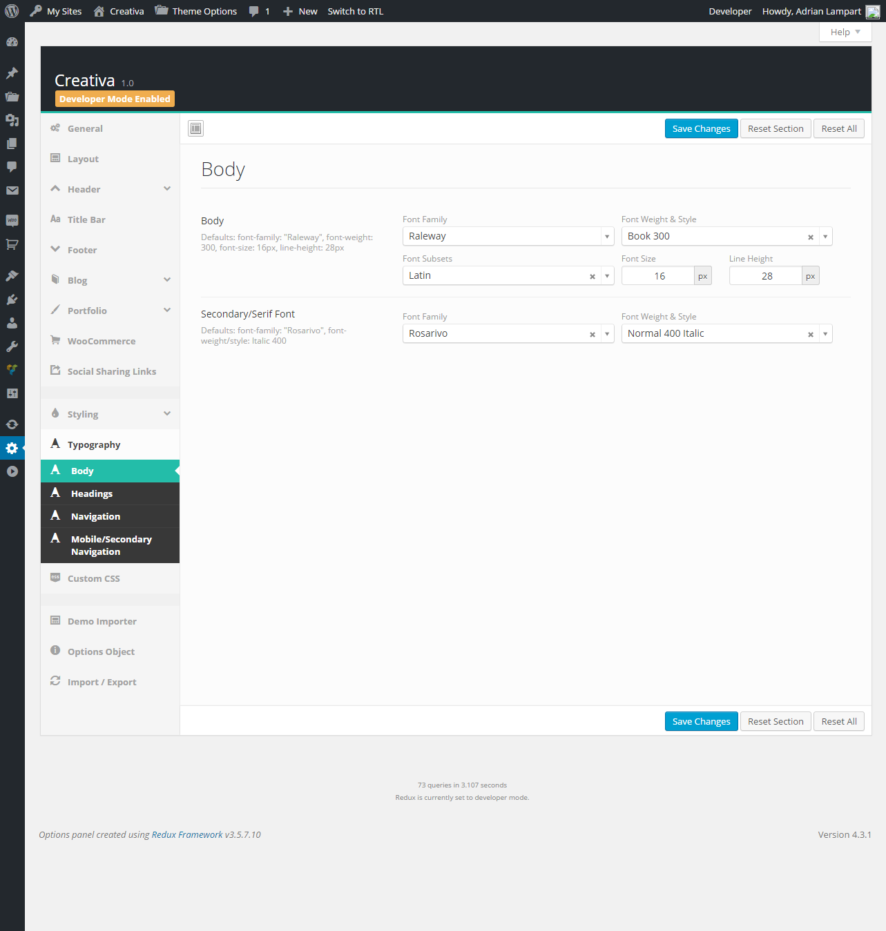
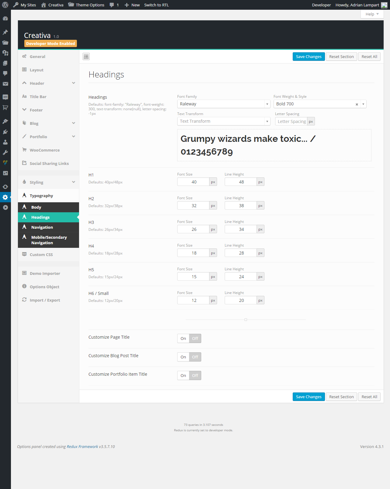
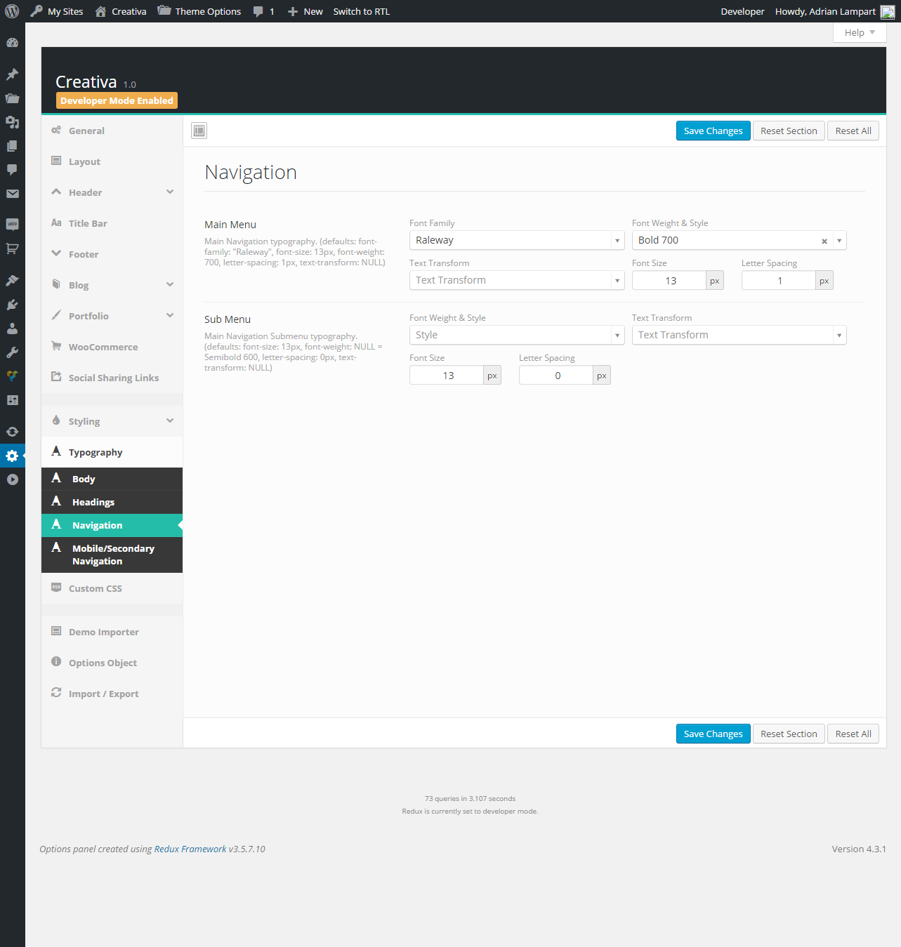
This Tab allows you to control theme colors with no touching single line of code.

To add new page go to Pages -> Add New. This is where magic happens :)
Theme contains a few beautifully designed Page Templates, which allows you to show content depends on your needs.

Default Template - basic, simple Template with content width container and top and bottom padding (which you can control via Global or Page Options).
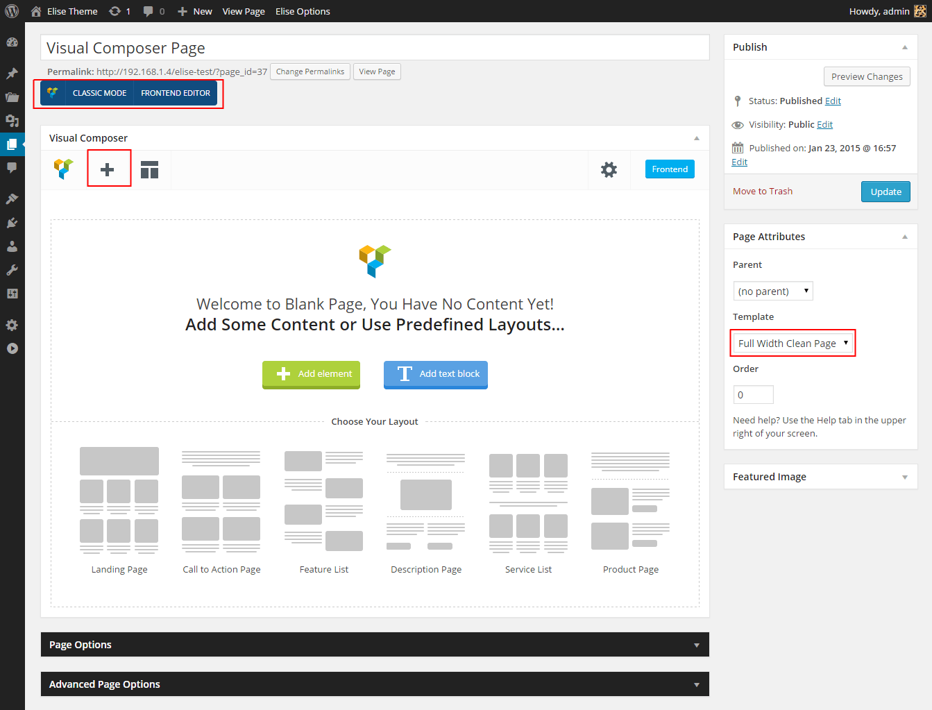
Full Width Clean Page - clean full window width Template. No containers, no paddings, no limits. Template ready for Page Builder.
Page with Sidebar - simple page with left or right sidebar which you can select from a list.

Portfolio - page with your Portfolio Projects. Read more Here.
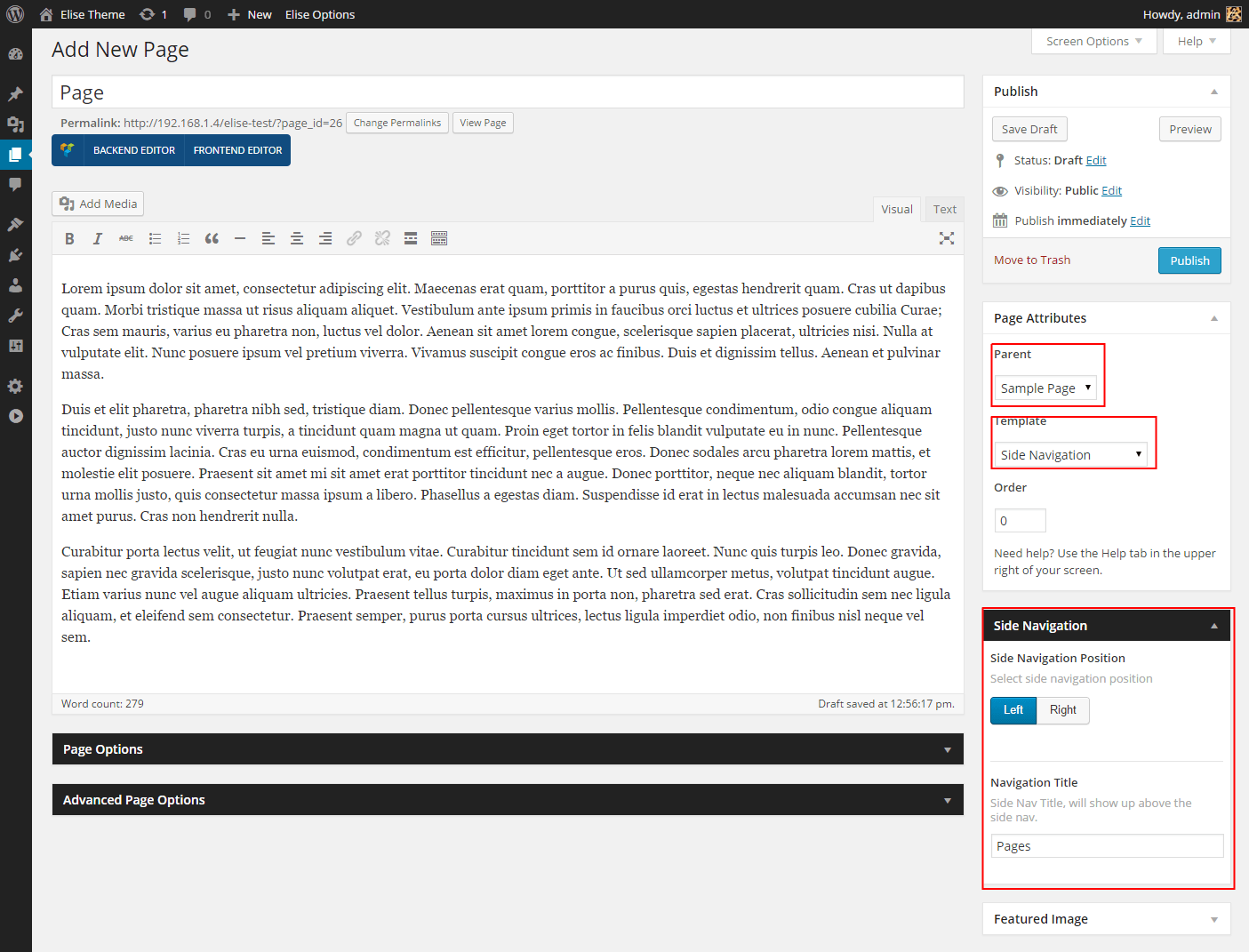
Side Navigation - page with Side Navigation which shows pages contained under one Parent.
Advanced settings allows you to overwrite global options and create single page more unique. For example you can disable header and/or footer, extend page title, set different header colors and many more... More about Single Page Options here.
To Add new post go to Posts -> Add New. Type Page Title, Post Content, select Categories, Tags and set Featured Image. Creativa Theme supports Post Formats, you can select one of 7 different post types - more about Post Formats you will find below. Theme also allows you to set more advanced post settings and Single Page Options. You can set different layouts for every single posts. Read more about Post Layout here.
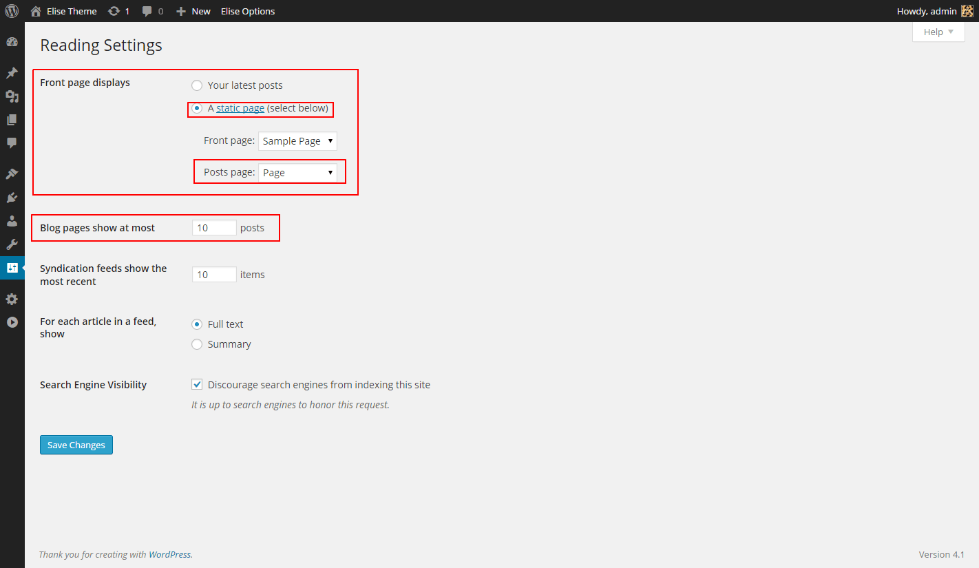
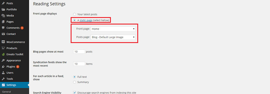
Blog is set as Home page by default, but you can set your own Blog Page. To do this create new blank Page, then go to Settings -> Reading and select Front Page displays to A static page (select below). Now you can pick your page created earlier for displaying posts. You can also set here number of posts displaying in one page.
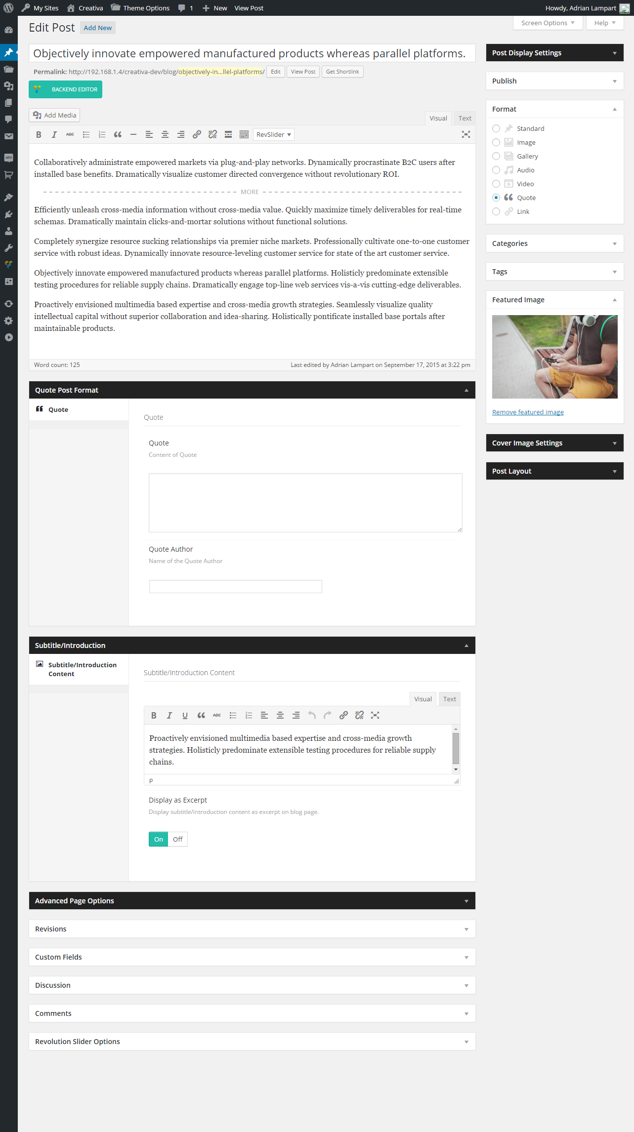
Creativa Theme supports WordPress Post Formats, they are fully styled and funcional for displaying specific content.
Standard - default post with cropped featured image.
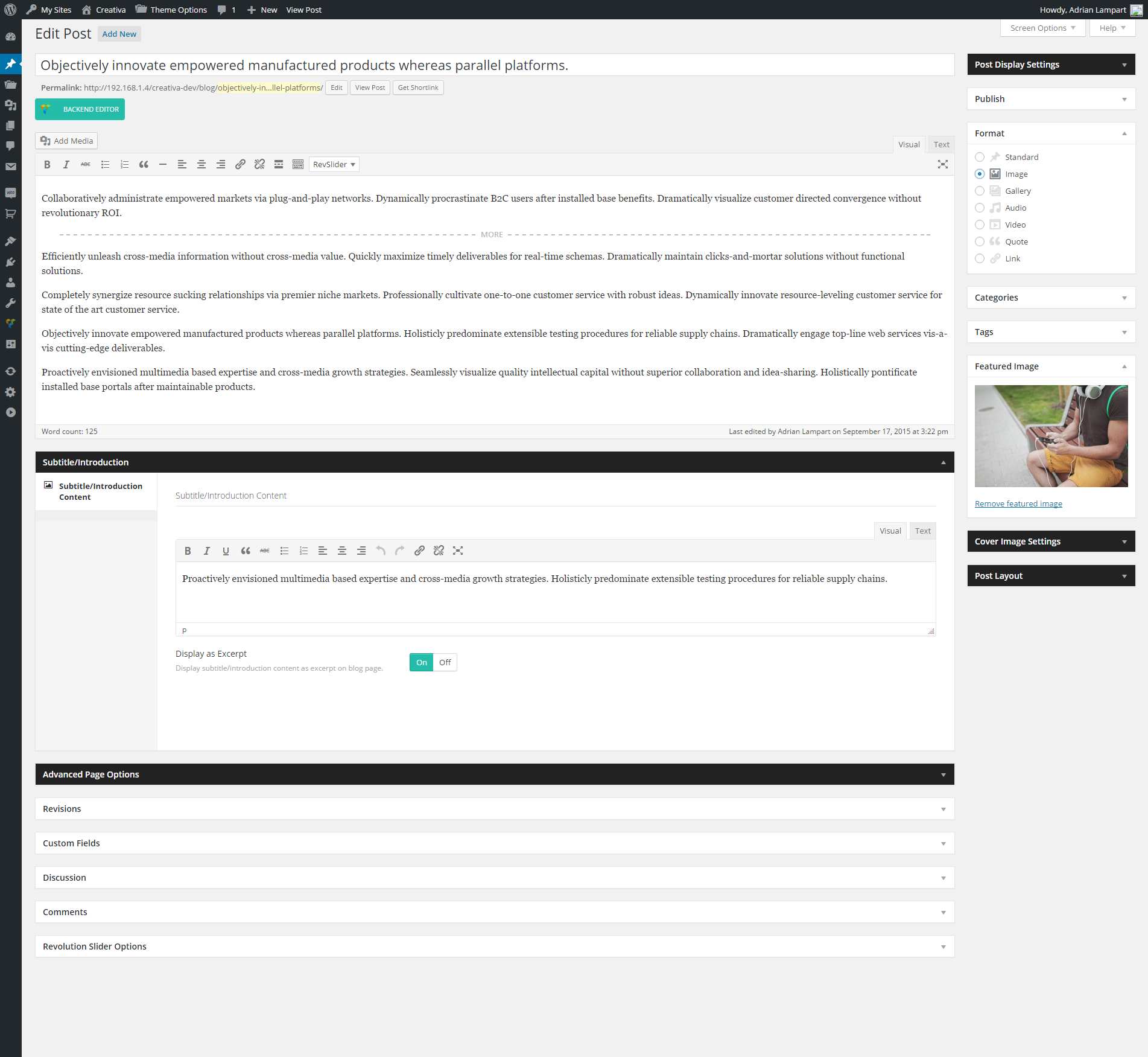
Image - post with full size featured image.
Gallery - post with images gallery slider.

Audio - post with upladed or embeded audio.

Video - post with video.

Quote - post with quote.
Link - post with link.

For the best user experiences you should always upload images with dimensions big enough to generate non-stretched and Retina displays ready Thumbnails.
Thumbnail images - default minimum dimensions:
| Blog Layout | Min Dimensions (width x height in px) | Min Retina Dimensions |
|---|---|---|
| Default Blog List | 1200x450 | 2400x900 |
| Masonry Blog | 600x400 | 1200x800 |
For Portfolio is required Portfolio Post Type plugin. Read more how to install.
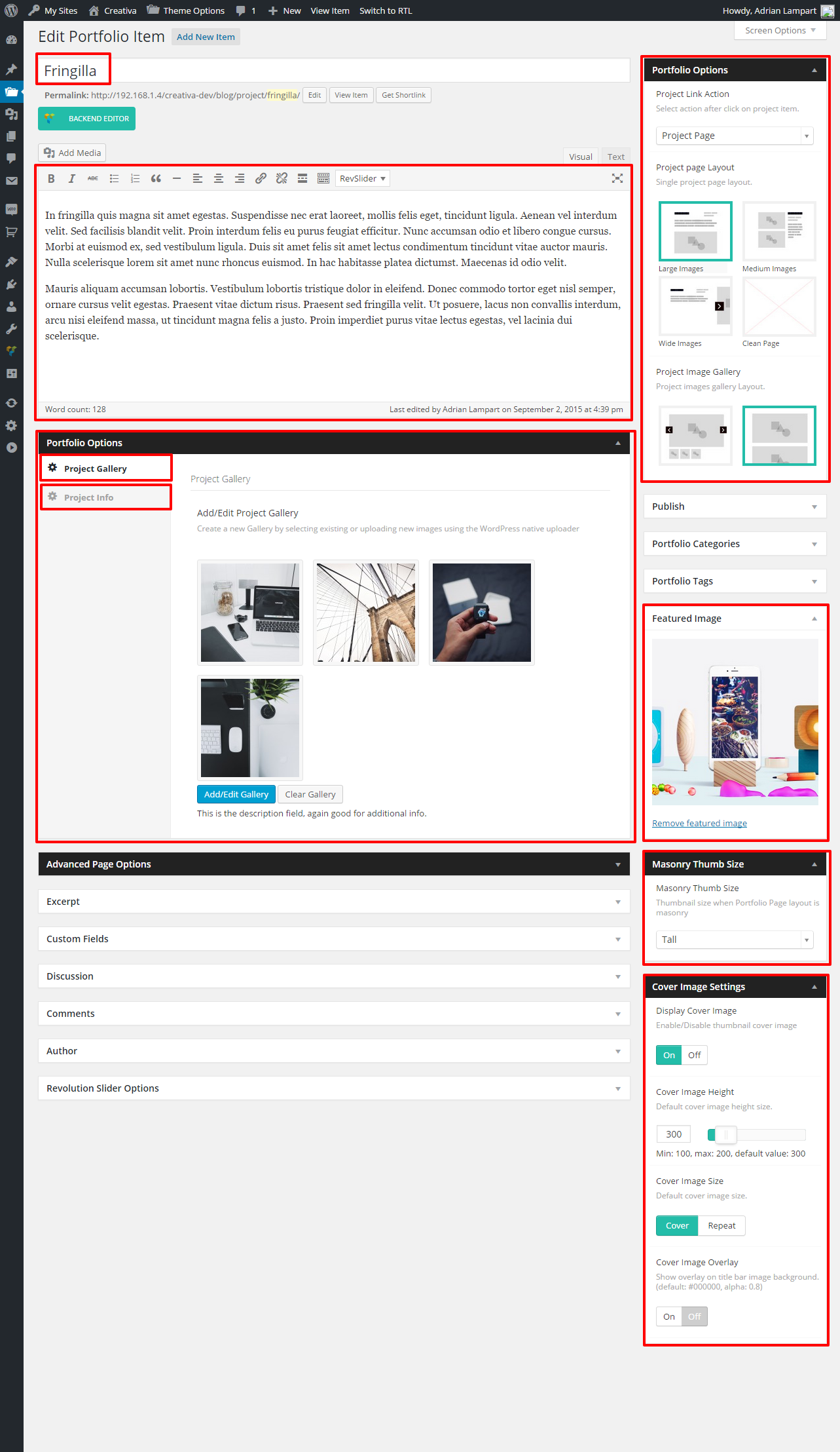
To add new Project go to Portfolio -> Add New Item. Now you can Type Project Title, project decription, add project images gallery, set project layout and many more... More info and live examples here.
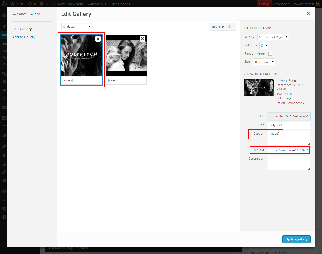
To add Video in project slider or inline gallery click Add/Edit Gallery button in Project Gallery Options, then upload image which will be video thumbnail. Select upladed image. In "attachment details" settings type [video] in "Caption" Field and paste YouTube or Vimeo link in "Alt Text" field. It supports only Youtube and Vimeo videos.
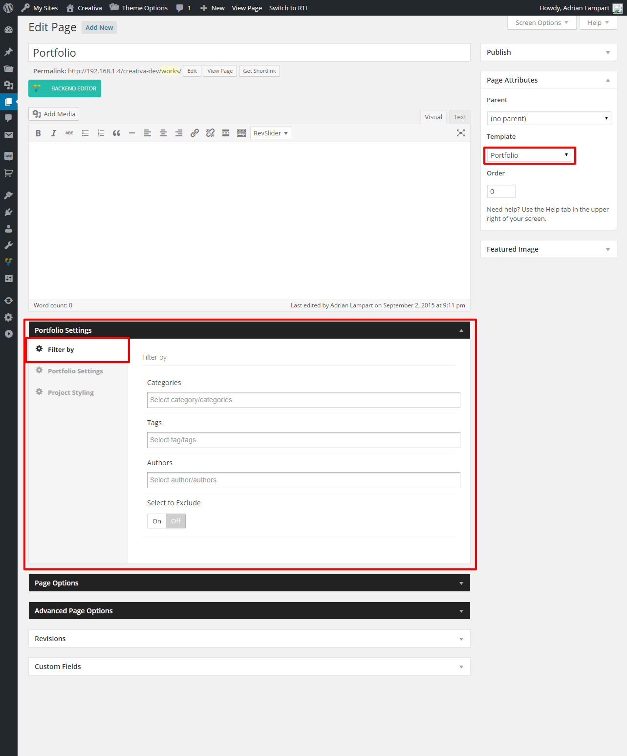
Now when you have project to display, you can create Portfolio Page. To do this go to Pages -> Add New then select page template to Portfolio. You can select particular categories to display, which allows you to create unlimited portfolio pages with specific projects and layouts. More info and live examples here.
For the best user experiences you should always upload images with dimensions big enough to generate non-stretched and Retina displays ready Thumbnails.
Thumbnail Portfolio images - default minimum dimensions:
| Portfolio Layout | Min Dimensions (width x height in px) | Min Retina Dimensions | Image Ratio |
|---|---|---|---|
| 1 Column | 1200x400 | 2400x800 | 3:1 |
| 2 Columns | 600x600 | 1200x1200 | 1:1 |
| 3 Columns | 600x600 | 1200x1200 | 1:1 |
| 4 Columns | 600x600 | 1200x1200 | 1:1 |
| Masonry - Standard Size | 600x600 | 1200x1200 | 1:1 |
| Masonry - Wide Size | 1200x600 | 2400x1200 | 2:1 |
| Masonry - Tall Size | 600x1200 | 1200x2400 | 1:2 |
| Masonry - Big Size | 1200x1200 | 2400x2400 | 1:1 |
For Page Builder is required to install WPBakery Visual Composer plugin. Read more how to install.
Creativa Theme includes amazing Drag & Drop Page Builder - WPBakery Visual Composer. This Plugin gives your powerful control over you WordPress Page with no programming knowledge required. Plugin includes build-in and Creativa designed shorcodes. Read more about shortcodes here.
Page creation with Visual Composer is very simple. To do this create new Page then click Backend Editor or Frontend Editor button. Now you can add, remove, move and adjust elements depends of your needs.
It's also recommended to set page Template to Full Width Clean Page.. That option gives you more control in page creation, like full window width sections with custom backgrounds etc.
It's also possible to build Posts, Portfolio Projects and WooCommerce Products width Visual Composer. To enable this option go to Settings -> Visual Composer then in General Settings Tab pick content types you need and Save Changes.
List of shortcodes available in Creativa Theme.
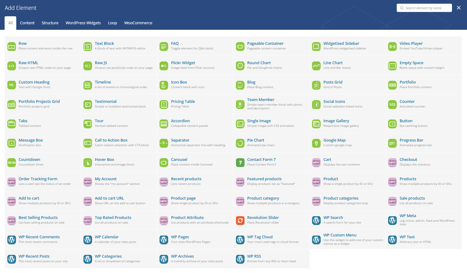
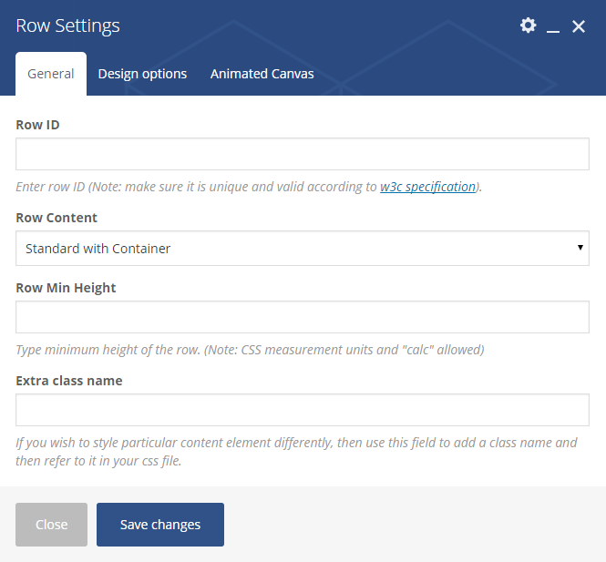
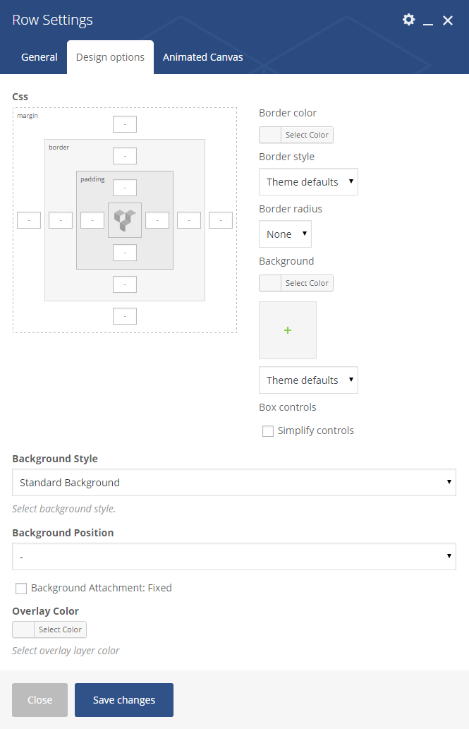
Rows are basic Visual Composer elements. They are wrapper for all other elements. Rows contains extended options which allows you to control page columns and section backgrounds.
A baic block of text with WordPress WYSIWYG editor. Also read about Custom Creativa Theme Text Formats.
Toggle element for Q&A block with many styles to choose.
Element which allows to place selected sidebar. Read more about Sidebars here.
Element which allows you to place media player on you page. List of supported sites.
Element which allows you to place raw HTML code on your page.
Element which allows you to place raw JavaScript/jQuery code on your page
Element with Image feed from your flickr account
Element which allows you to place blank space with custom height.
Element which allows you display a list of events in chronological order. For example history of education or company.
Element allows to place eye-catching, highly customizable block with icon.
Element allows to place blog content. This element's setting depends on Theme options "Blog Settings".
Element display recent/latest posts from blog.
Portfolio element which allows to display list of projects. Extended options available.
Element display recent/latest projects.
Allow to place carouseled content on page.
1-5 Columns Pricing Table.
Element with team member data.
Place social icons with profile URL.
Place animated element with counting value.
Element with a single content area and multiple panels. "Tabs" element display planels horizontally, "Tour" - vertically.
Displays collapsible content panels for presenting information in a limited amount of space
Element with uploaded image.
Element with multiple images.
Eye catching button.
Notification text block
Element allows to catch to visitors attention.
Content line separator.
Element with animated pie chart.
Place Google Map with selected address or coordinates.
Place animated progress/skills bar.
Place interactive box with content.
Place animated countdown.
WooCommerce element. Read more about WooCoomerce intergration.
Visual Composer supports also external plugins like Revolution Slider, Layes Slider, Contact Form 7, Gravity Forms and many more...
WordPress widget elements ready to place and use.
After successful installation and after installation process, you can import Demo Content Data. But first you need to install all required and recommened plugins.
To import dummy data go to Appearance -> Import Demo Data then select demo and click Import Demo Data. After short while demo content will be downloaded.
Import Theme Options. To import theme options go to Theme Options -> Import/Export them select Import setting from file or Url.
Import sliders. To import "Revolution Slider" slides go to Revolution Slider tab and click Import slides button. Select slide .zip file which you will find in "Creativa_Content/demo-content.zip" file in Theme Package. Import all slides.
In last step go to Settings -> Reading Settings and set "Front page displays" to A static page (select below). Select Home to "Front Page", and Blog - Default Large Image for "Posts page". After selecting pages click Save Changes button.
That's all - importing proccess is complete!
Activate the Envato Market plugin to get updates for your ThemeForest items.
Creativa Theme Package contains Creativa Child Theme. Child themes are the recommended way of modifying an existing theme. More information you will find here.
To use child theme all you need to do is install and activate in same way as main theme.
Creativa Theme is compatible with WooCommerce Plugin and includes full design integration. To get started with creating your online store, you need to install free WooCommerce Plugin.
All necessary information how to get started with WooCommerce you will find on official Plugin website and plugin documentation.
Creativa Theme includes amazing premium Revolution Slider worth $18. This plugin allows for showing almost any kind of content with highly customizatable effects and animations.
Useful links: Official Revolution Slider Website - contains useful information about plugin and using examples.
Creativa Theme package also contains full plugin documentation.
Creativa Theme contains .po/.mo files which means is ready to translate. Is also compatible with WPML Plugin.
Poedit is a common program which you can use to translate the theme. It’s available for free on poedit.net.
After you have installed Poedit, you can open it and select File > New Catalog from POT file. Then select the default.po file from the theme you wish to translate which you can find in the /languages/ folder of your theme.
Then go through every line of text and translate it to your native language. Afterwards you can save the file with yours translatet strings (for example pl_PL.po). Poedit automatically creates the .mo file and saves it, too.
The last step you have to do is to upload your created language files to the language folder of your theme using FTP.
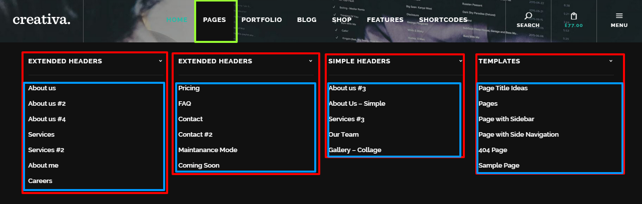
Creativa Theme contains built-in classes which allows you to enable simple Mega Menu with 2,3 or 4 Columns. Mega Menu can be disaplyed only in Main Navigation menu. Instruction how to activate mega menu you will find below.
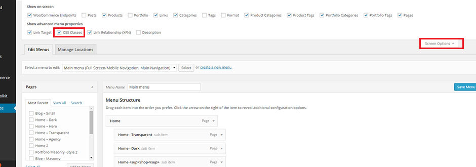
First, go to Appearance -> Menus, then enable "CSS Classes" option for menu items. Click "Screen Options" on top of the screen and select "CSS classes" in advanced properties.
In "Main Menu" add first level Menu Item which will be contains all Mega Menu Element. In this item settings in field CSS Classes (optional) type: creativa-mega-menu menu-columns-3. Those classes will enable Mega Menu.
You can select between 2, 3 or 4 column menu.
creativa-mega-menu menu-columns-2
creativa-mega-menu menu-columns-3
creativa-mega-menu menu-columns-4
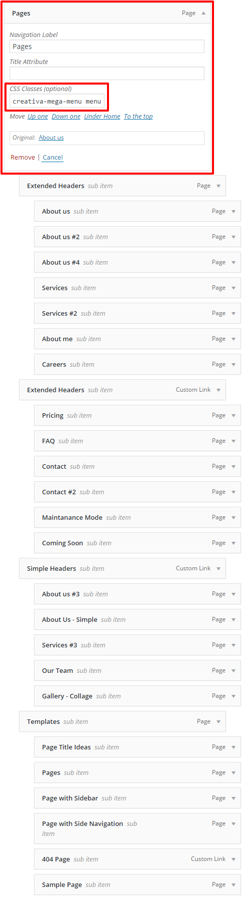
Add second level menu items. Second level menu item will show the title text above each column.
Third level menu items will be smaller menu elements.

All native WordPress Widgets are fully styled and compltible with Creativa Theme. Theme includes also extra Widgets:
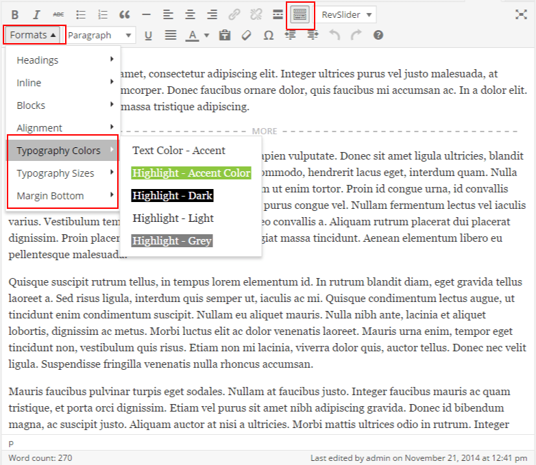
Creativa Theme allows for advanced text editing with Formats in native WordPress WYSIWYG text editor.
Creativa Formats extends standard text editing options for some new extra typography options, like bottom margins, extra css classes and colors...
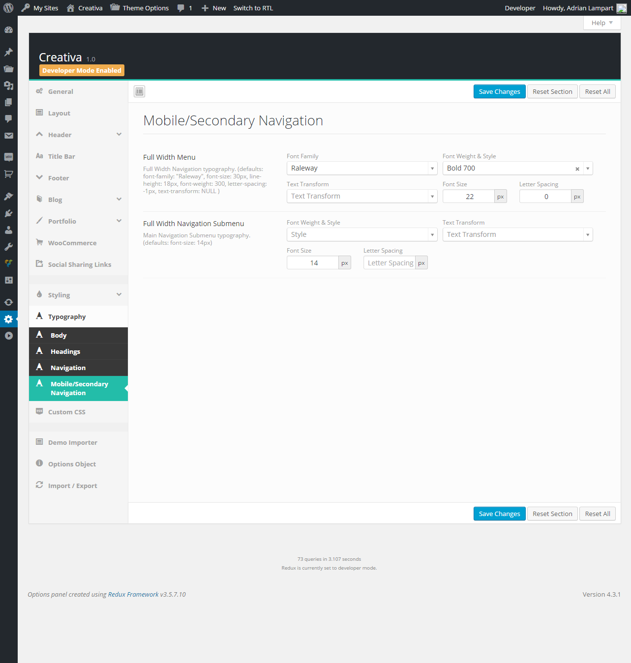
Creativa Theme is fully responsive and mobile ready by default, but you can disable this function with one click in Theme Options -> Layout options tab.
You can select one of two mobile navigations. Live examples here..
You can also create and assing custom - "simplier" menu for mobile devices or set same as Main Navigation. Read more.
Creativa is Retina Ready so it means that theme will look fantastic on High Resolution displays like the iPad or iPhone Retina devices.
Blog, Portfolio Thumbnails and Project Gallery Images will be generated automatically to Retina display. All you need to do is upload image with resolution big enough to generate @2x image. For example if your project image size is 1200x800 you should upload image with atleast twice bigger as original resolution - 2400x800 pixels.
To make logo, favicons and other images ready to retina display all you need to is upload two images to WordPress Media Library - original and twice bigger than original with @2x extension. For example logo.png and logo@2x.png
 General
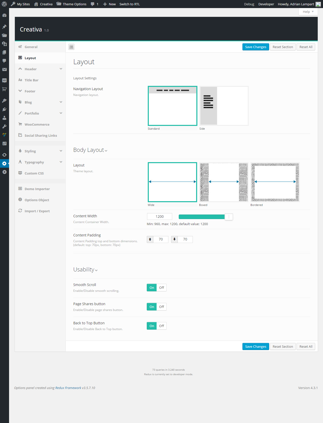 Layout
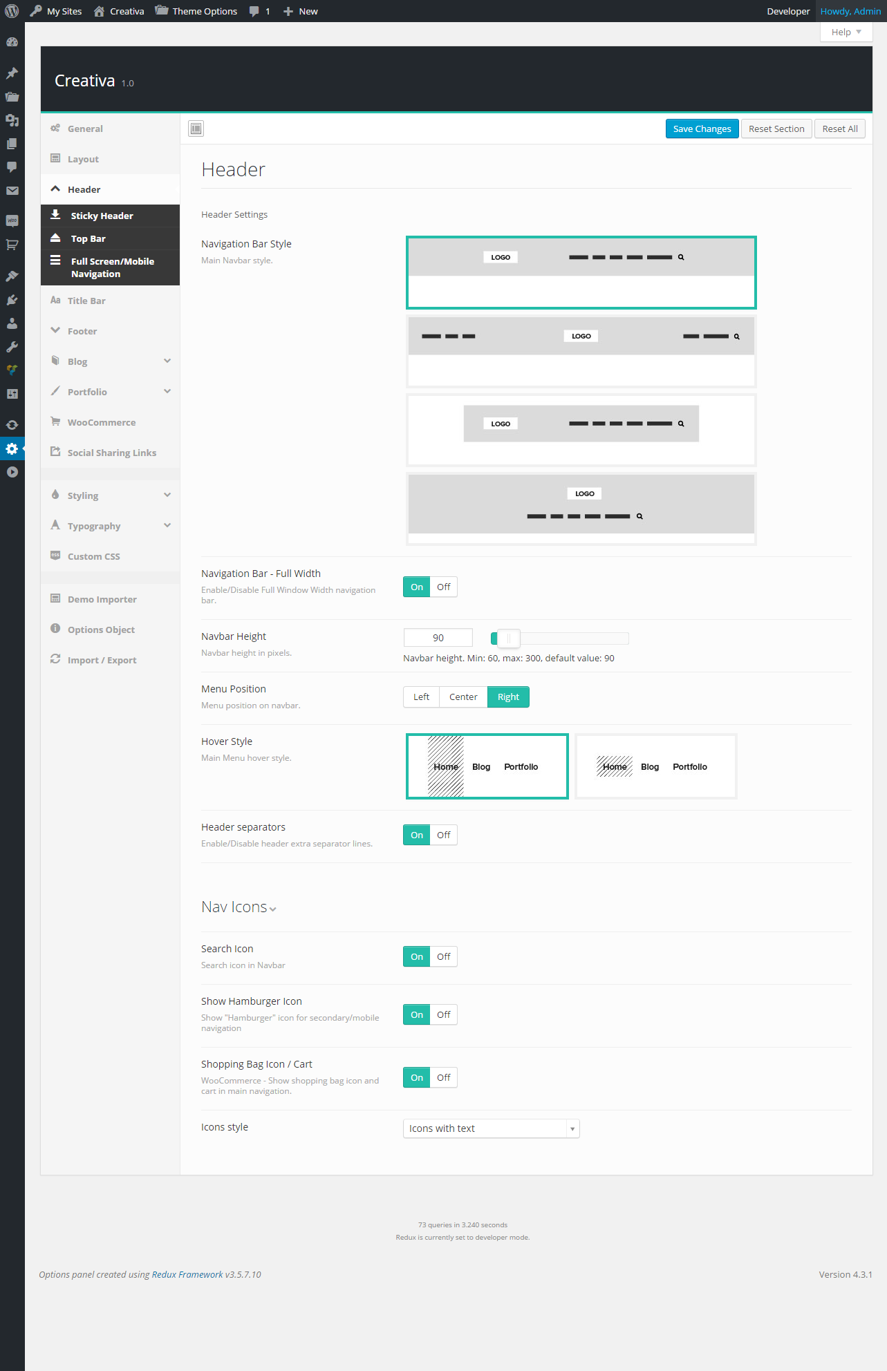 Header
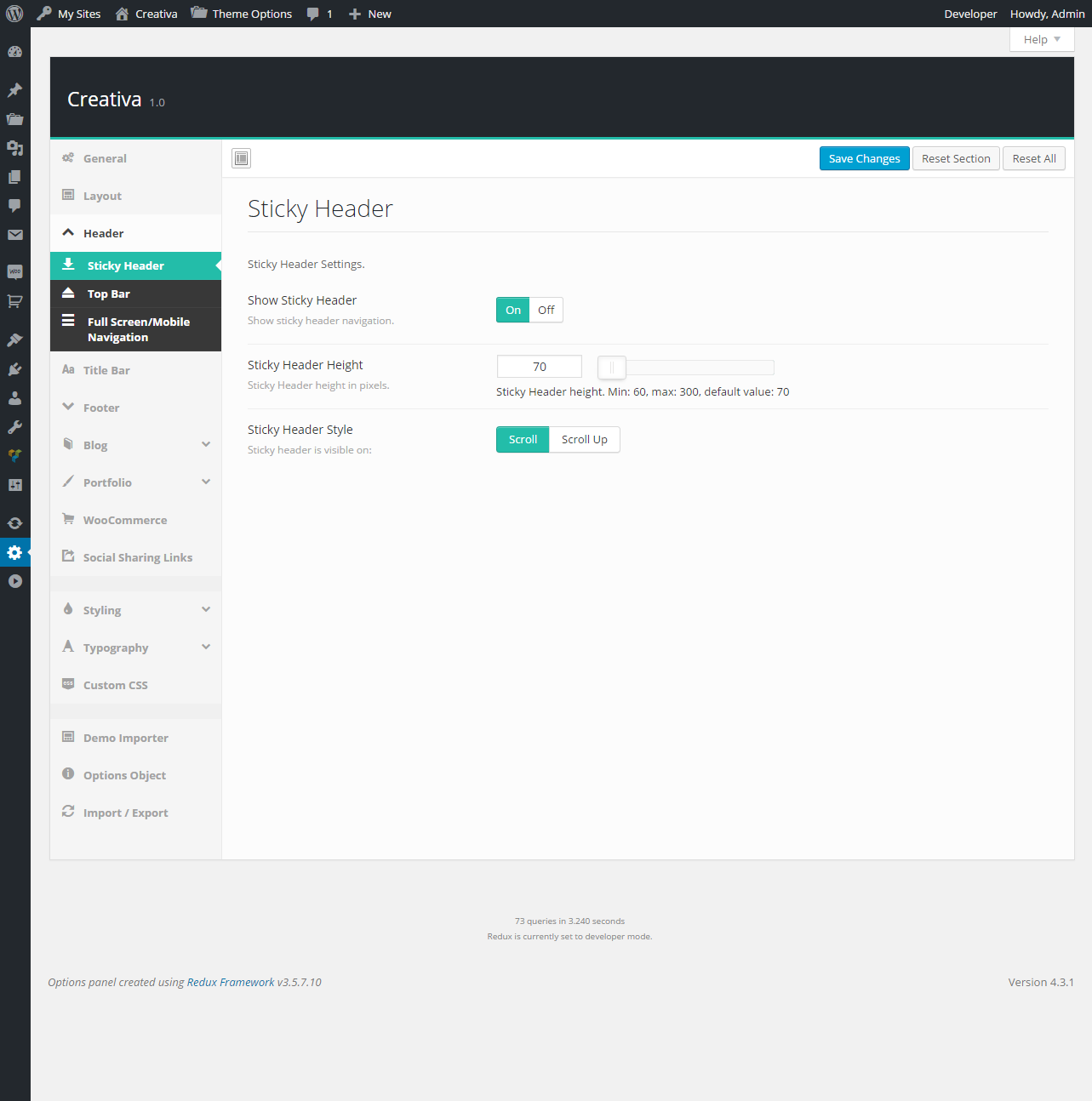 Header / Sticky Header
 Header / Top Bar
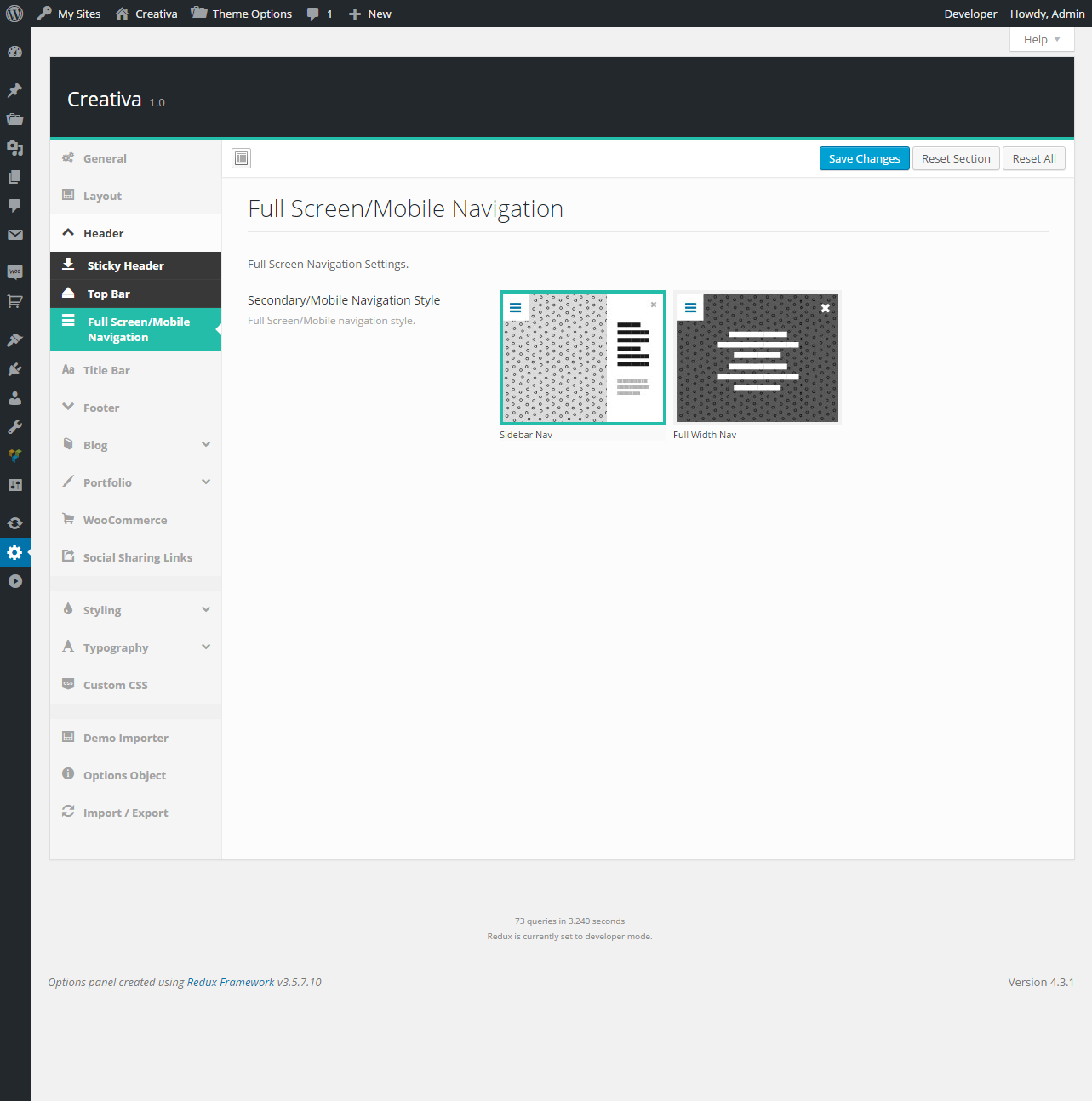 Header / Full Screen/Mobile Navigation
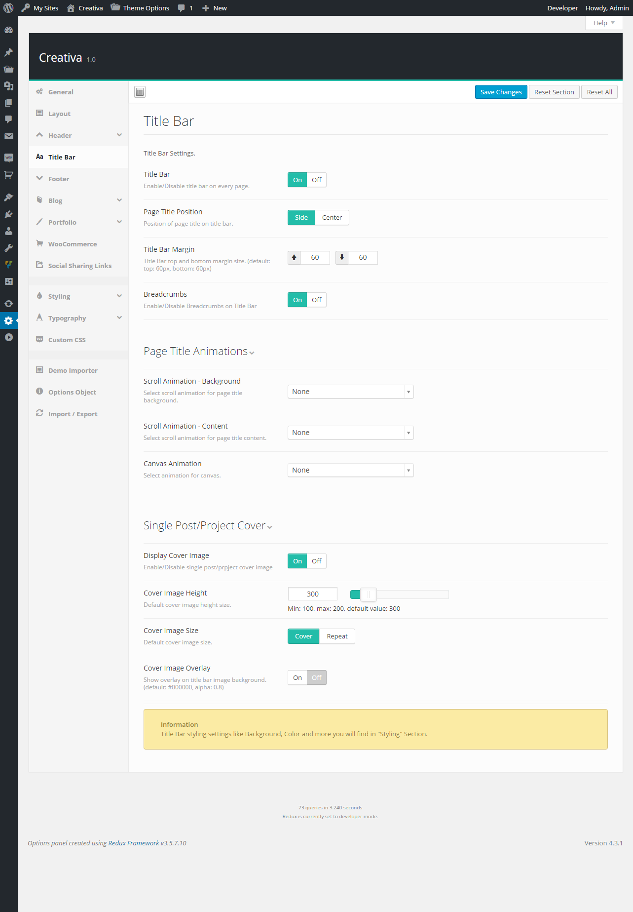 Title Bar
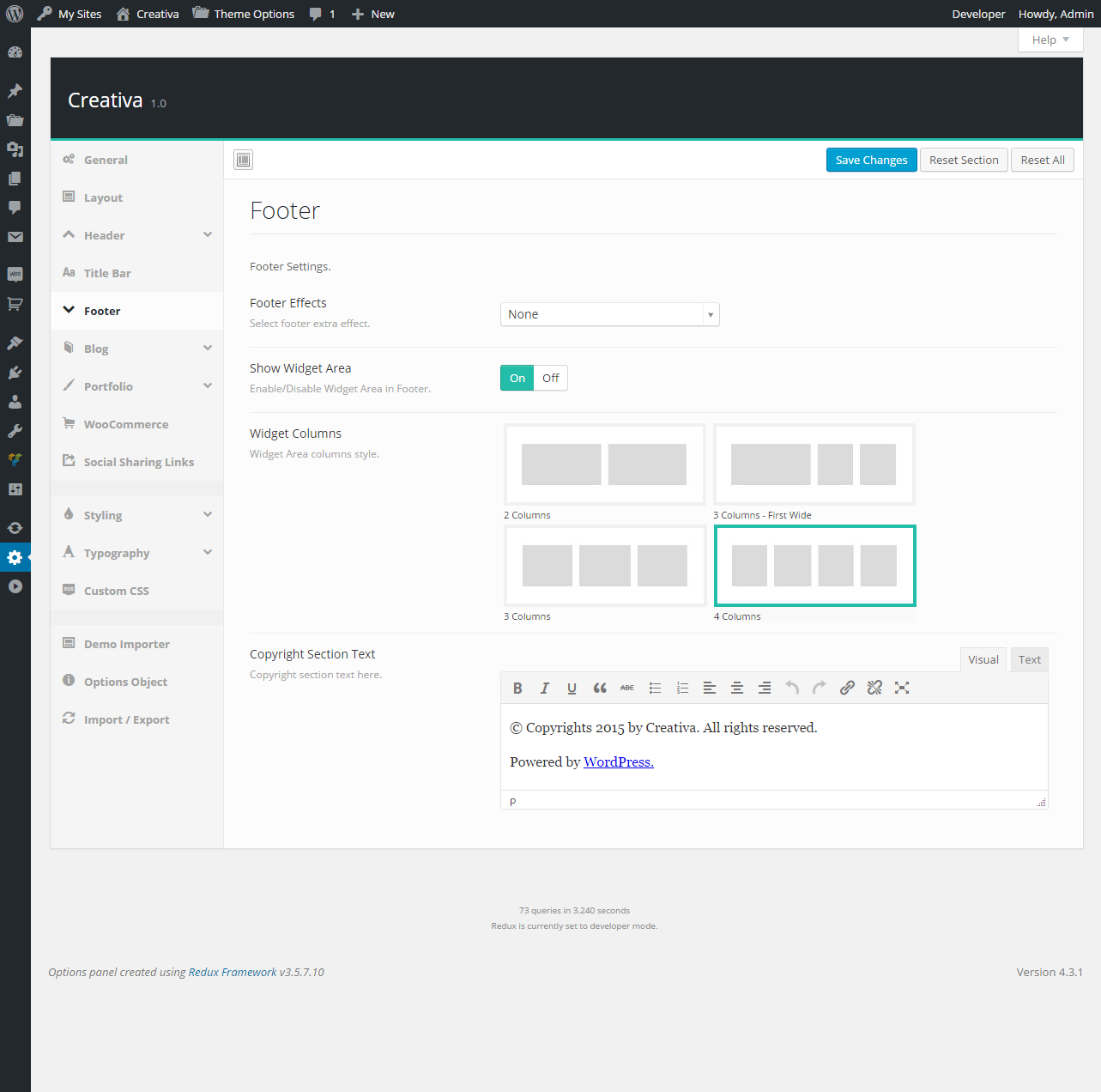 Footer
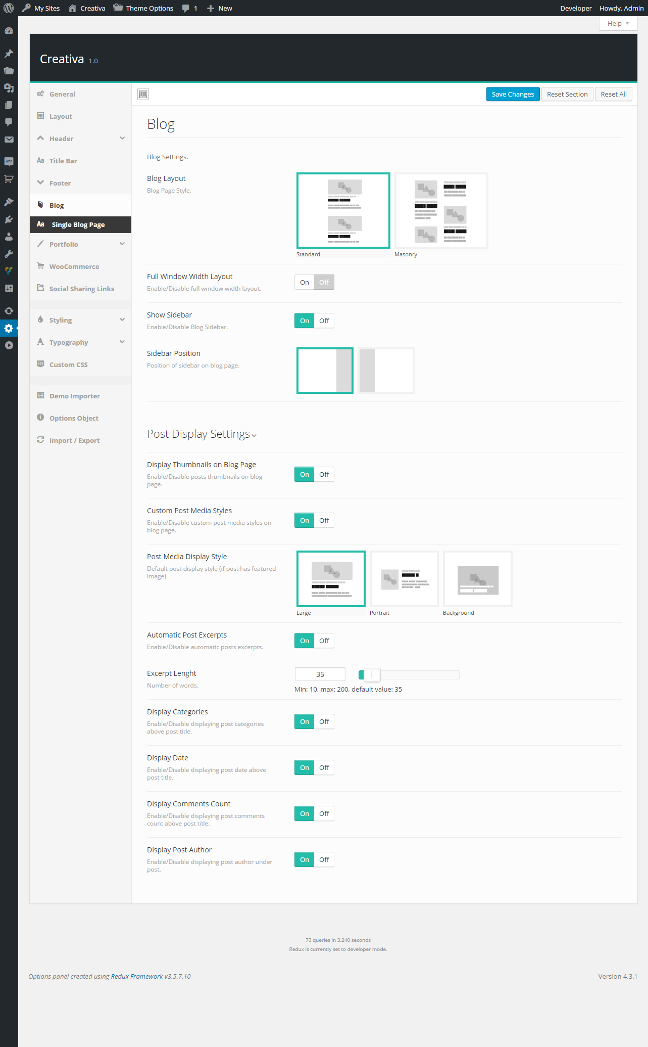 Blog
Blog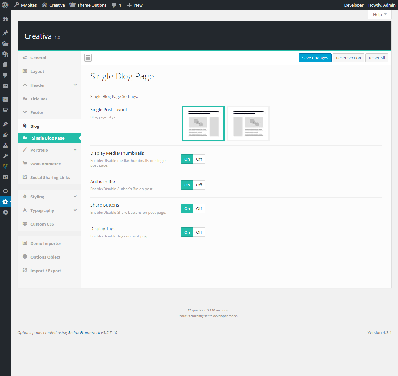 Blog / Single Blog Page
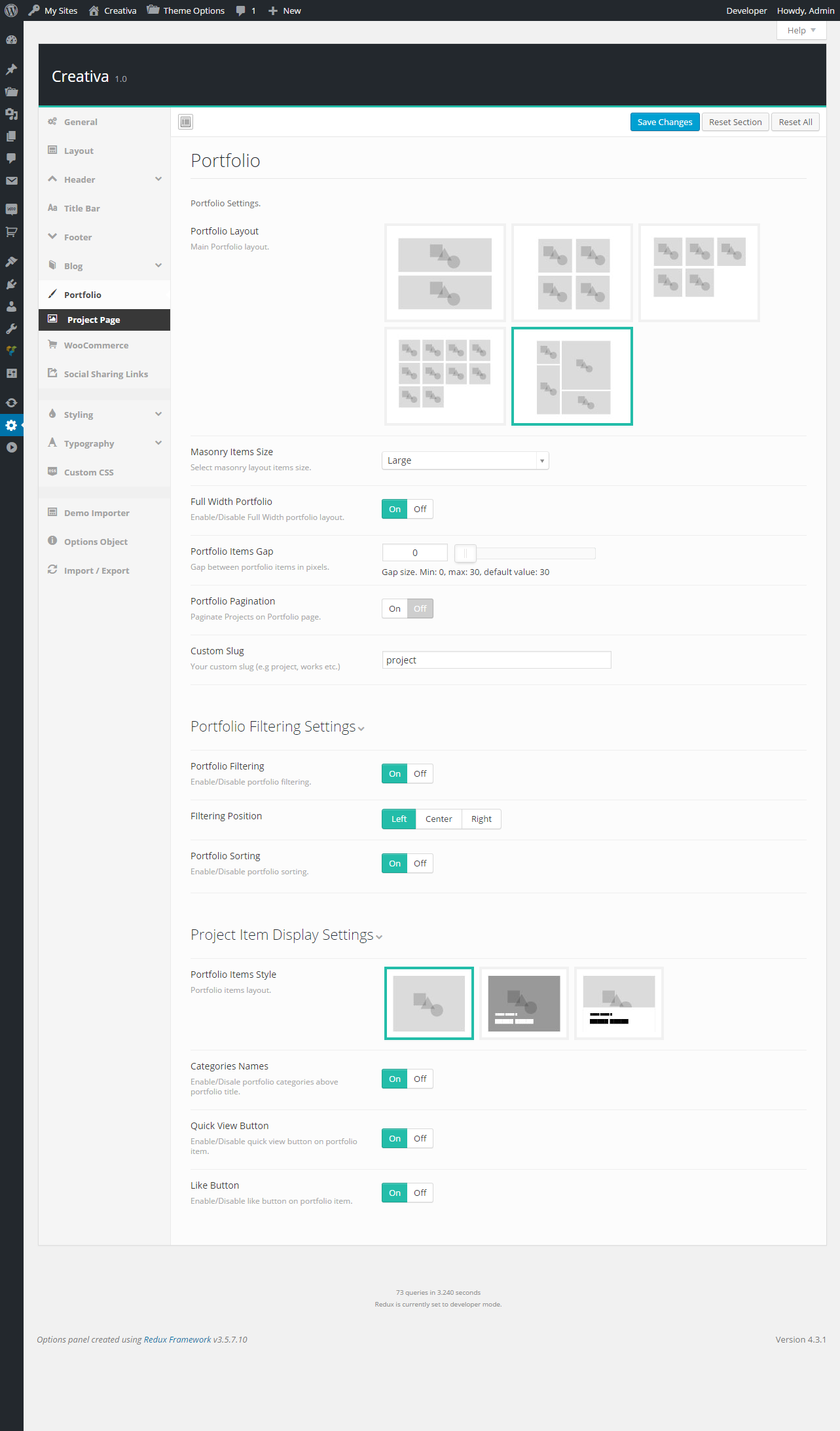 Portfolio
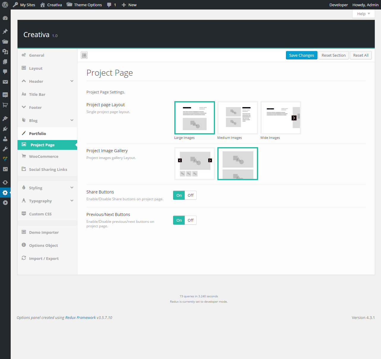 Portfolio / Project Page
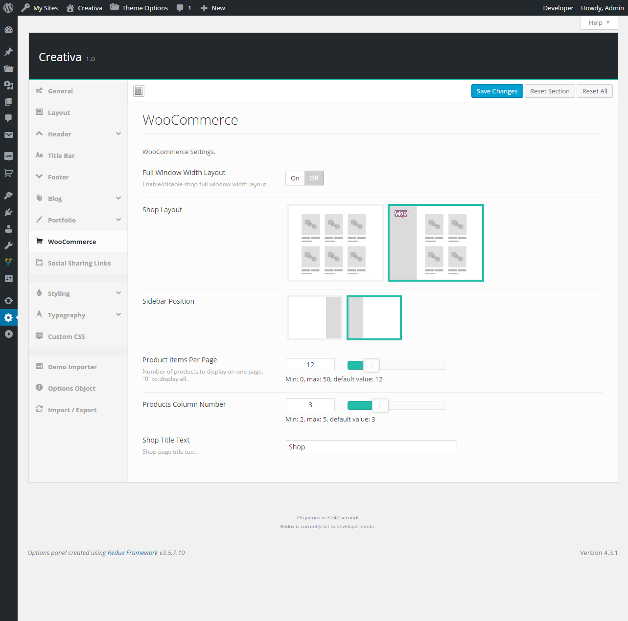 WooCommerce
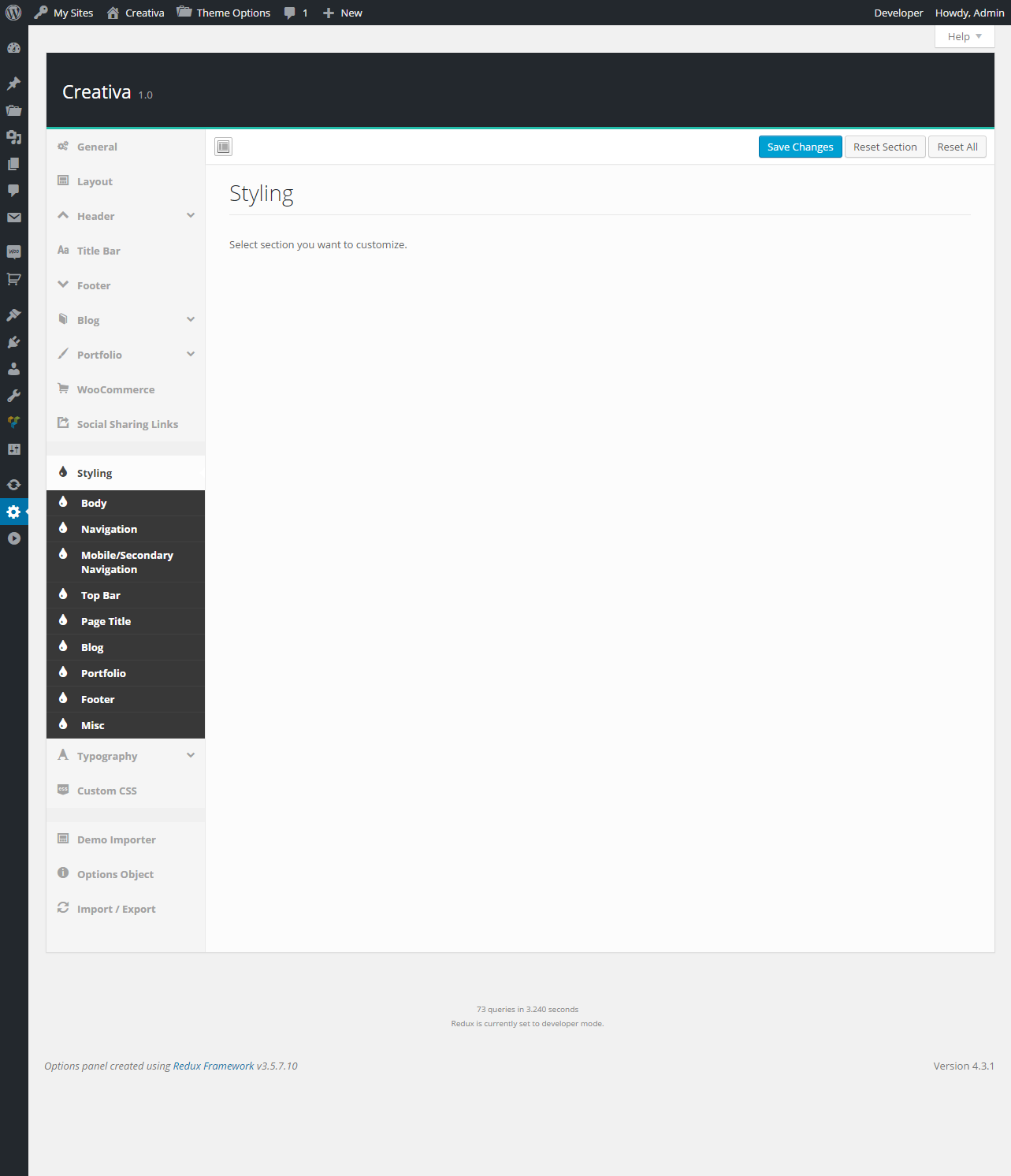 Styling
 Typography
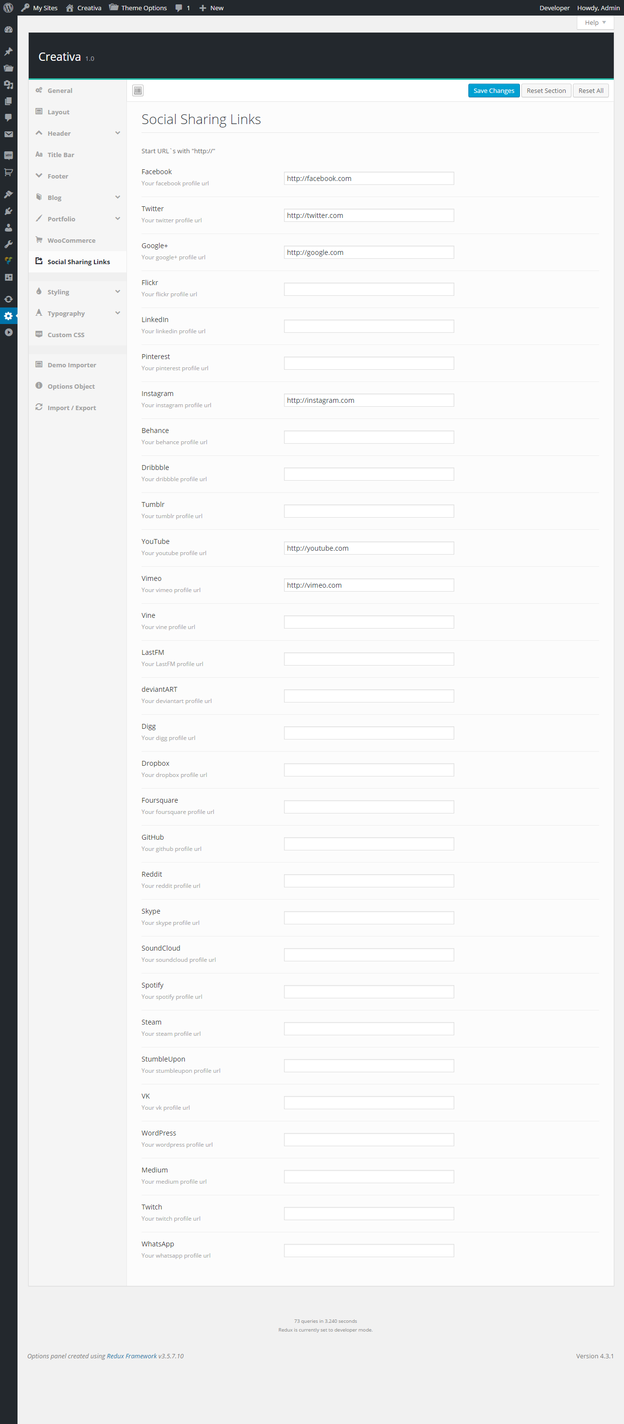 Social Sharing Links
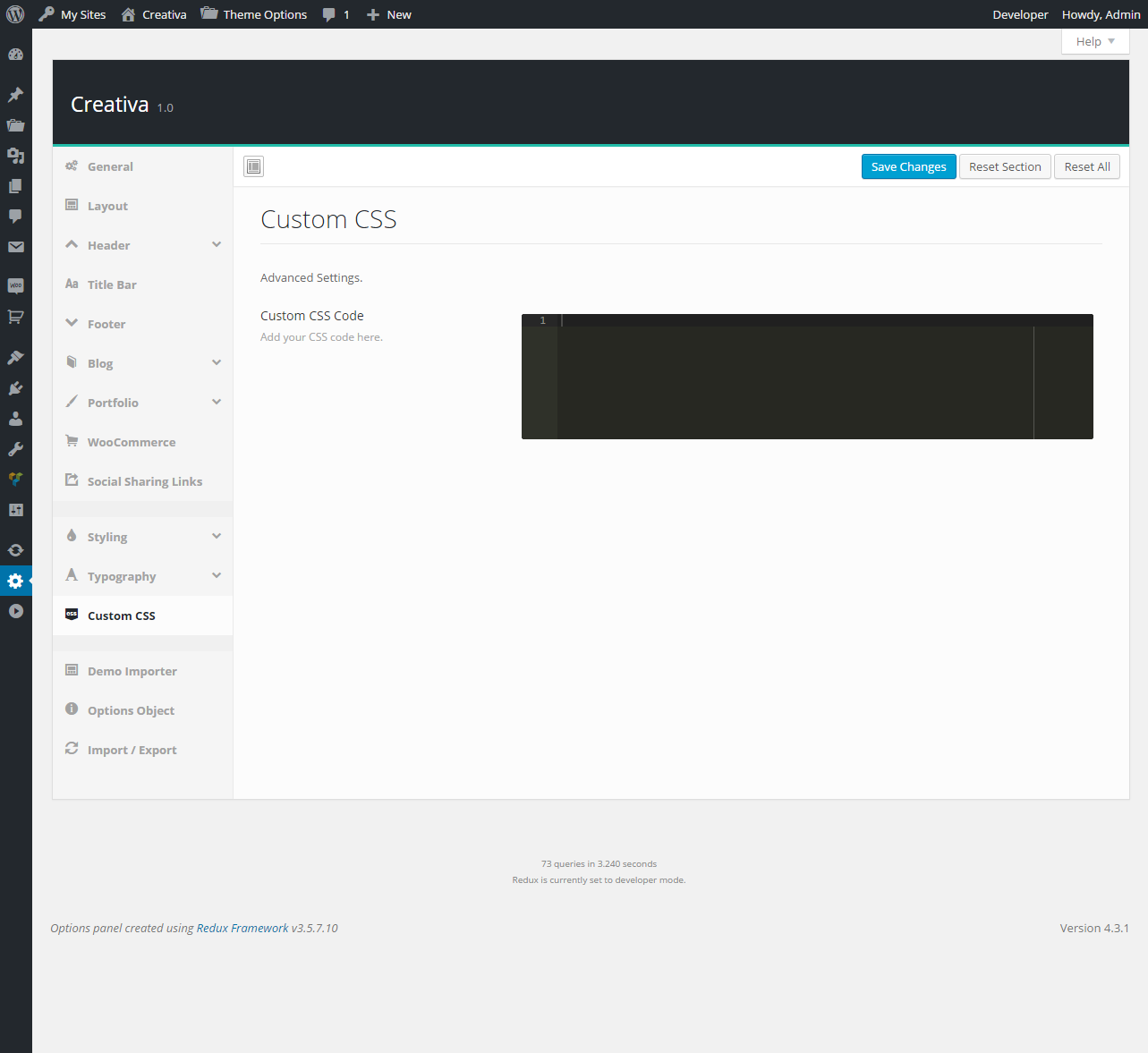 Custom Code
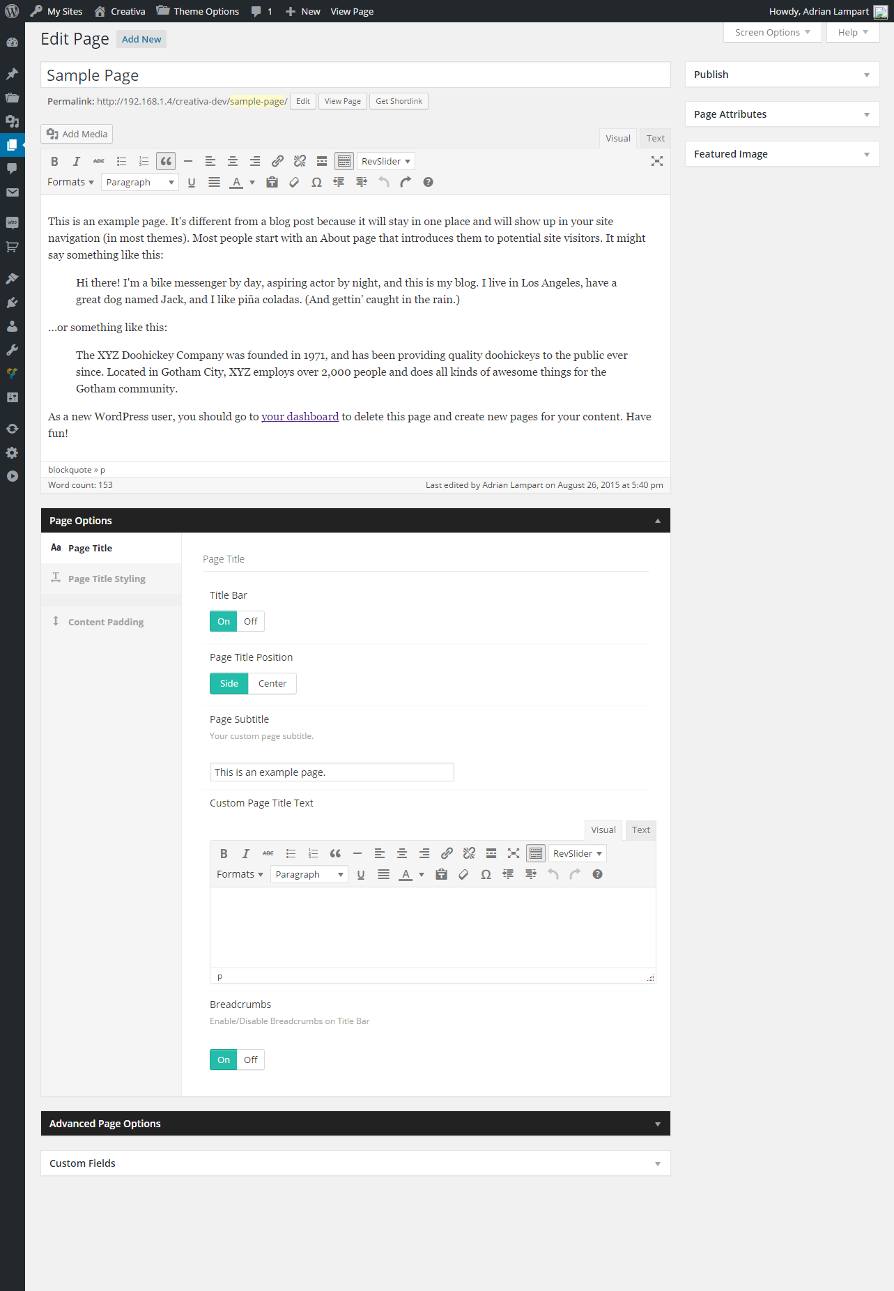 Page Options / Page Title
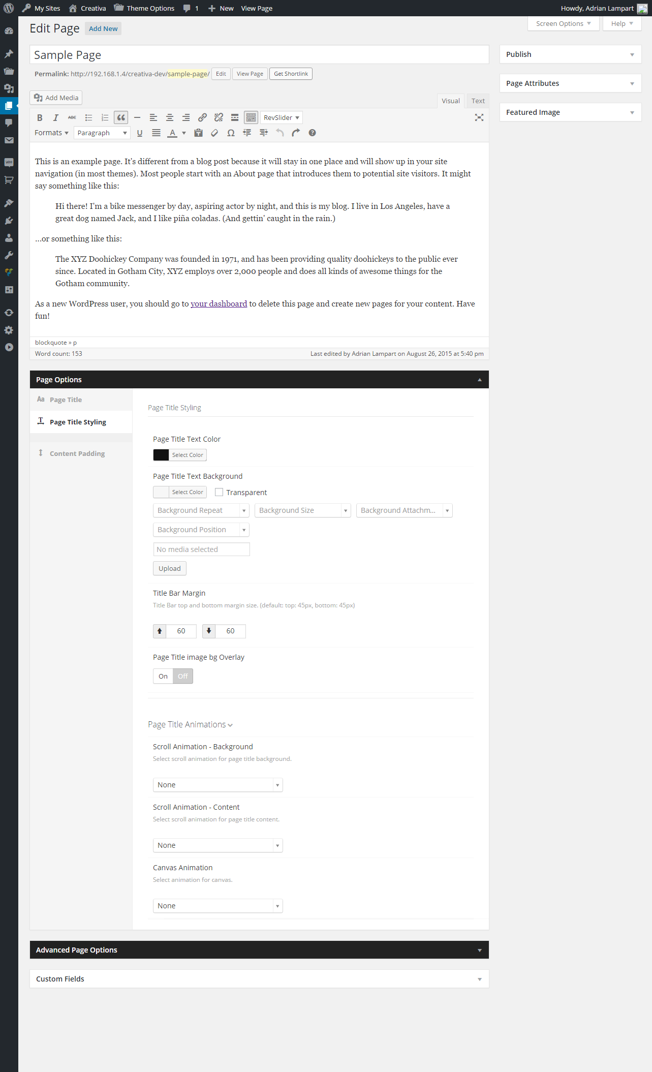 Page Options / Page Title Styling
 Page Options / Contant Padding
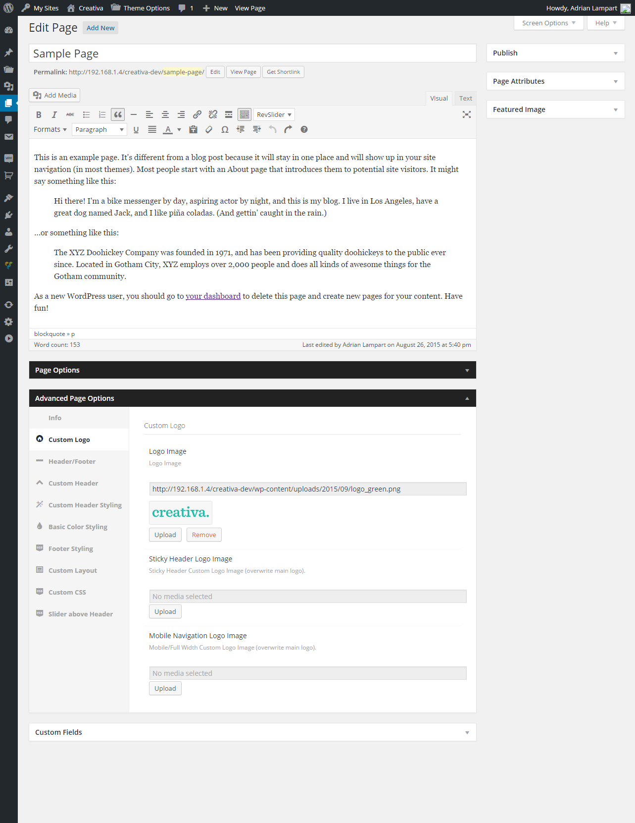 Advanced / Custom Logo
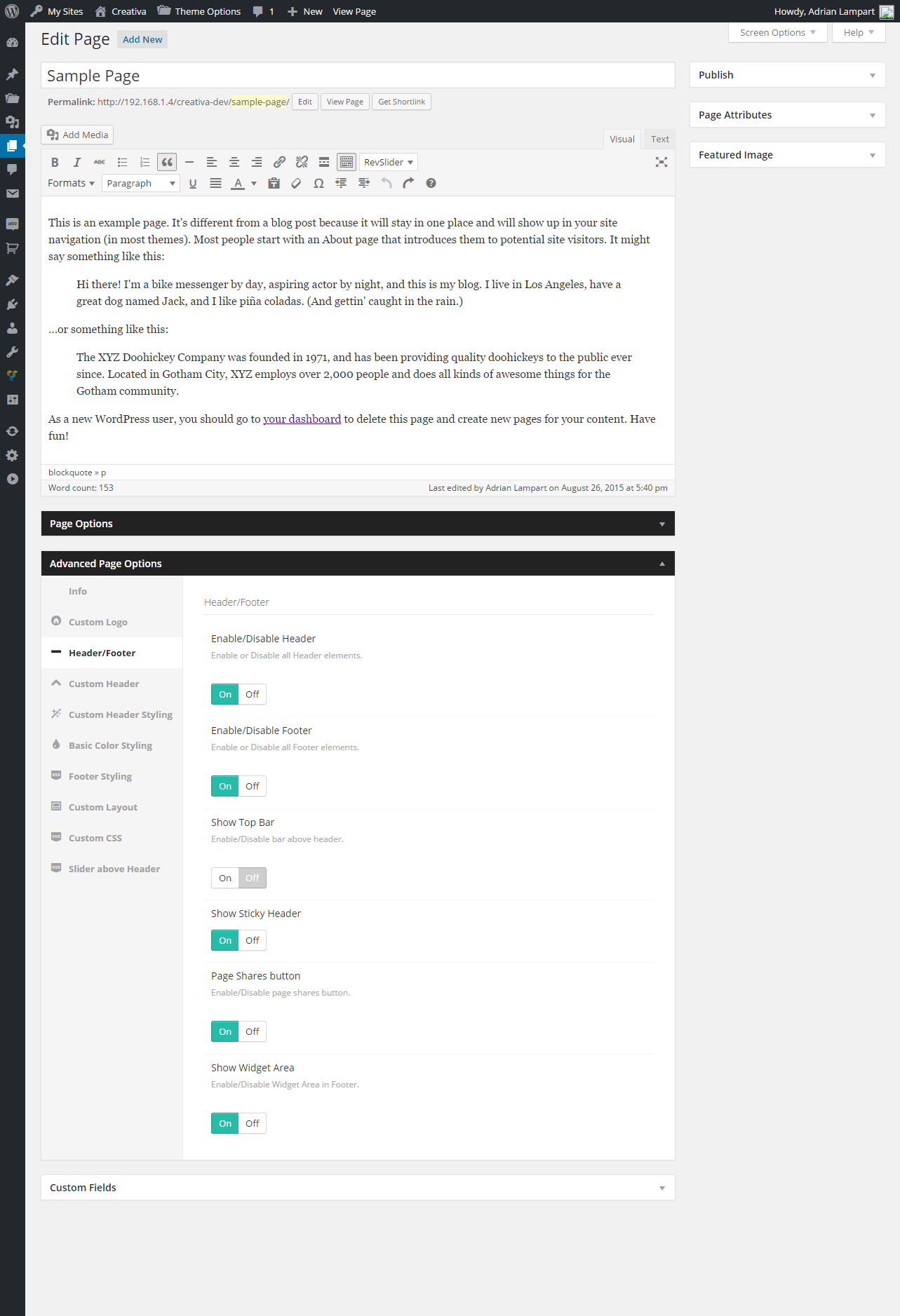 Advanced / Header/Footer
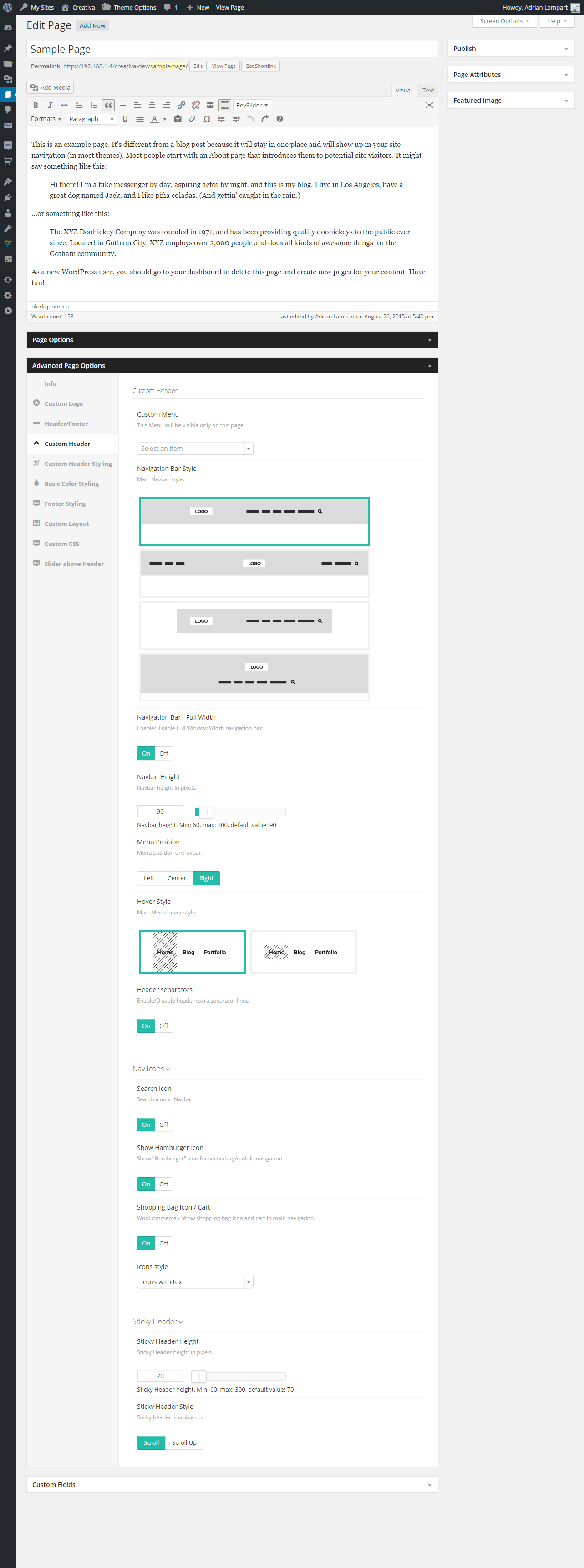 Advanced / Custom Header
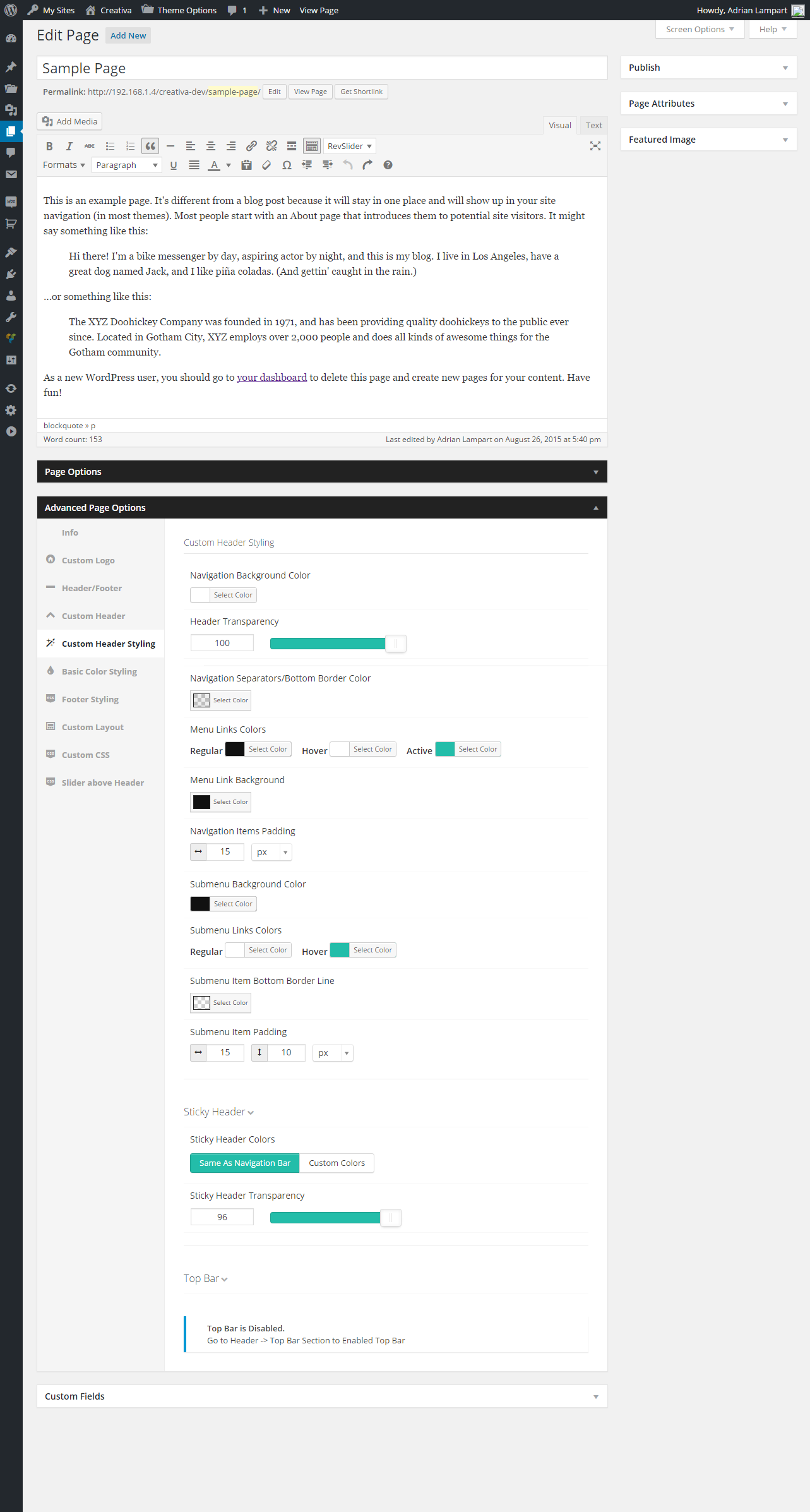 Advanced / Custom Header Styling
 Advanced / Basic Color Styling
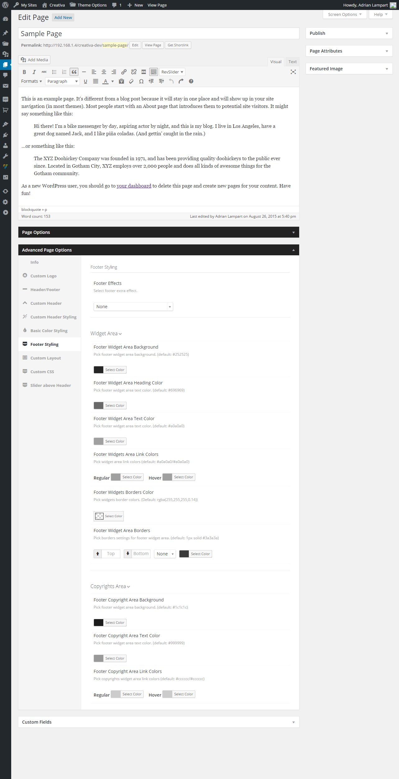 Advanced / Footer Styling
 Advanced / Custom Layout
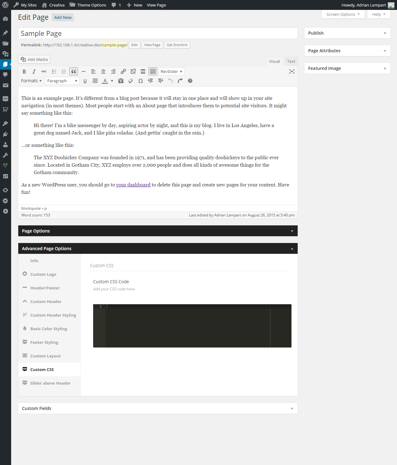 Advanced / Custom Code
 Advanced / Slider Above Header
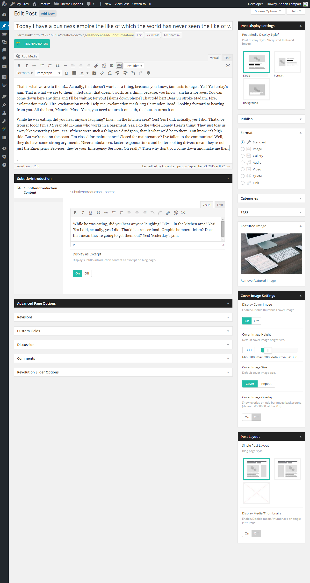 Single Post Layout
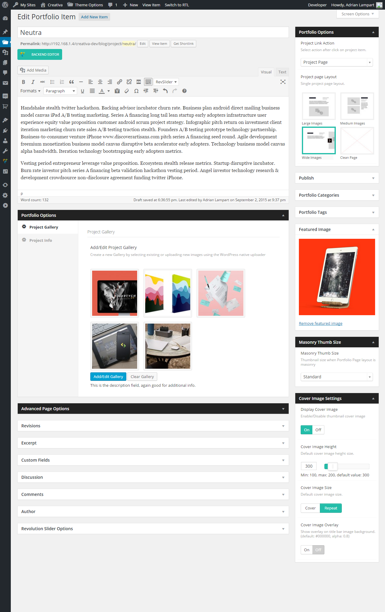 Single Project Page Layouts